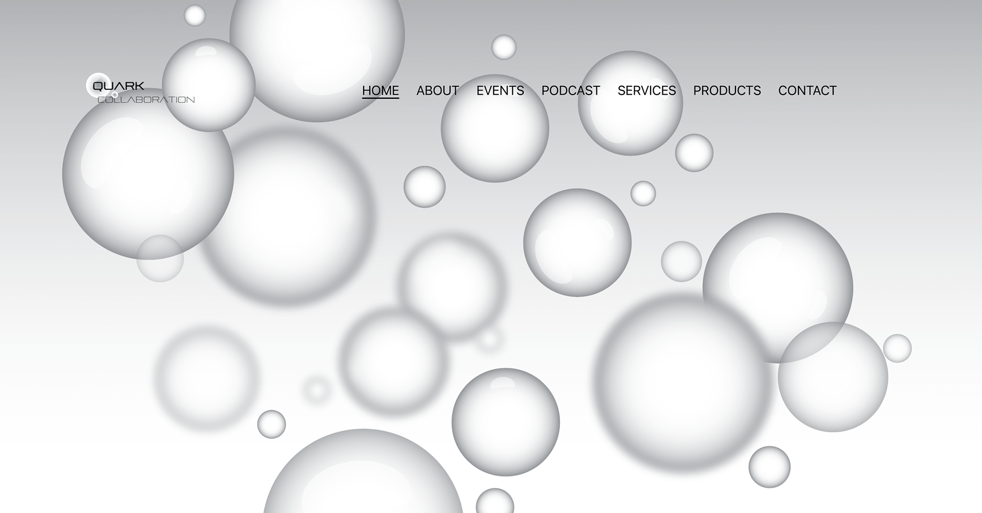
Brand Design, Client: Quark Collaboration Institute [JULY 2021]
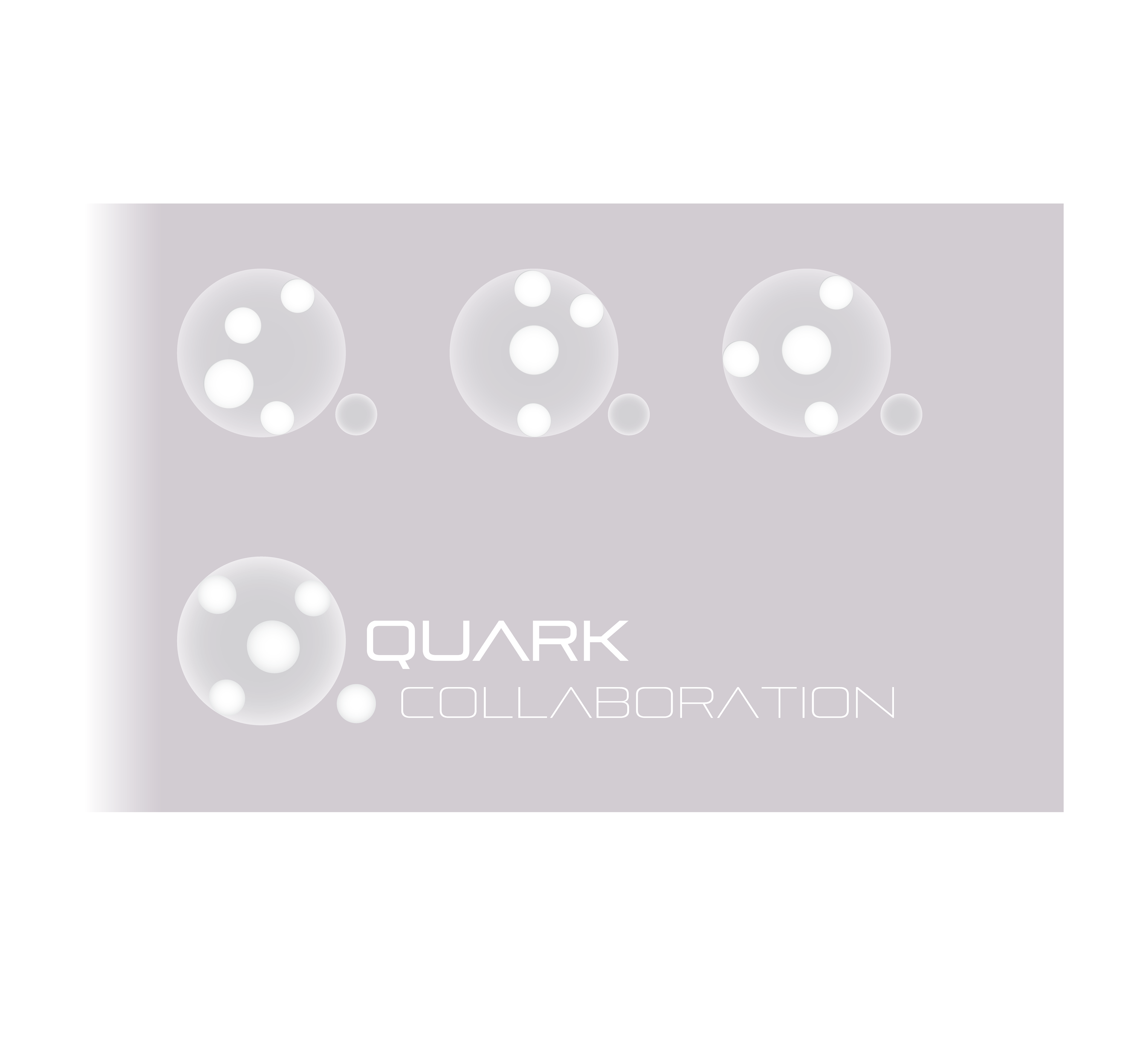
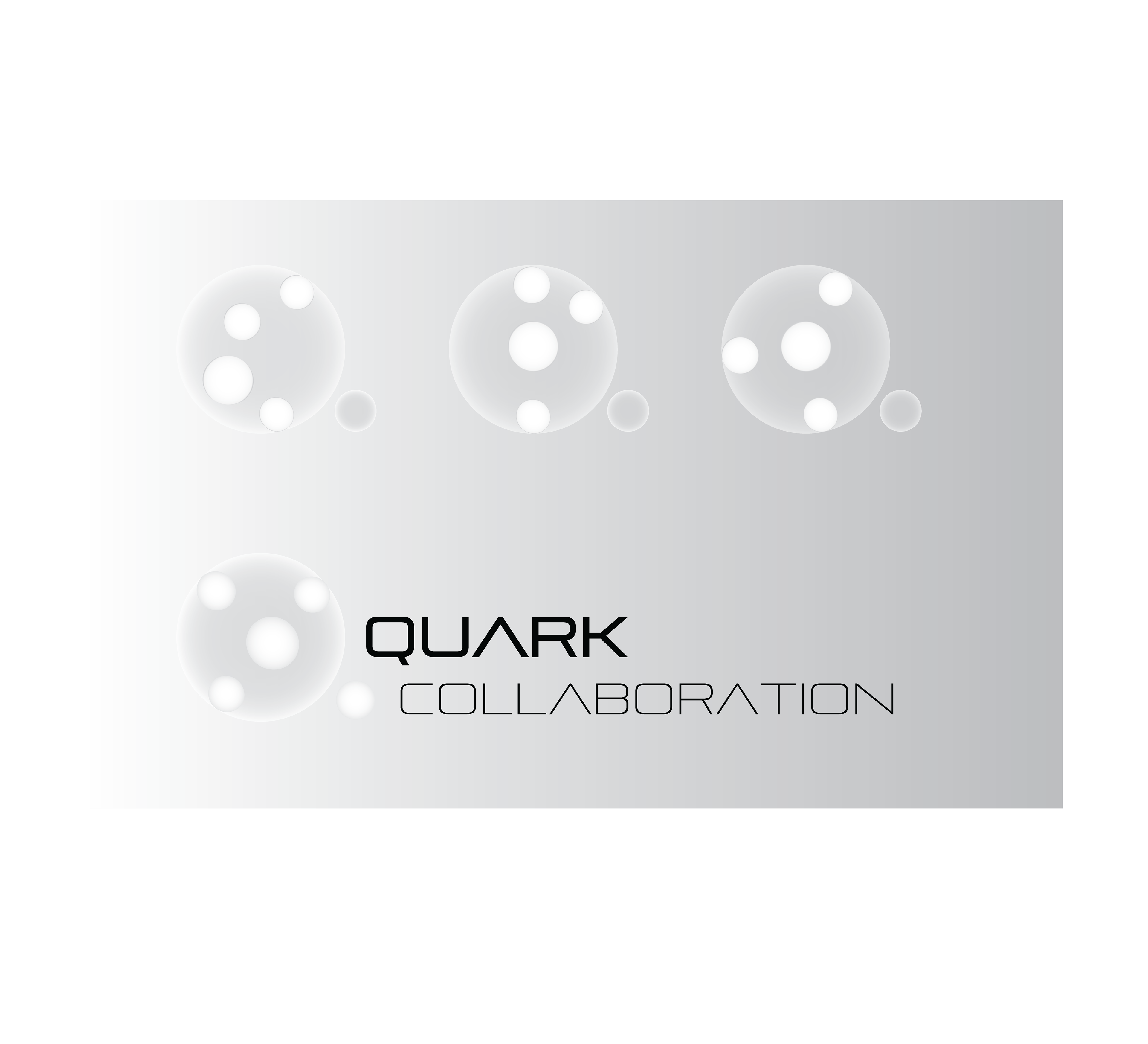
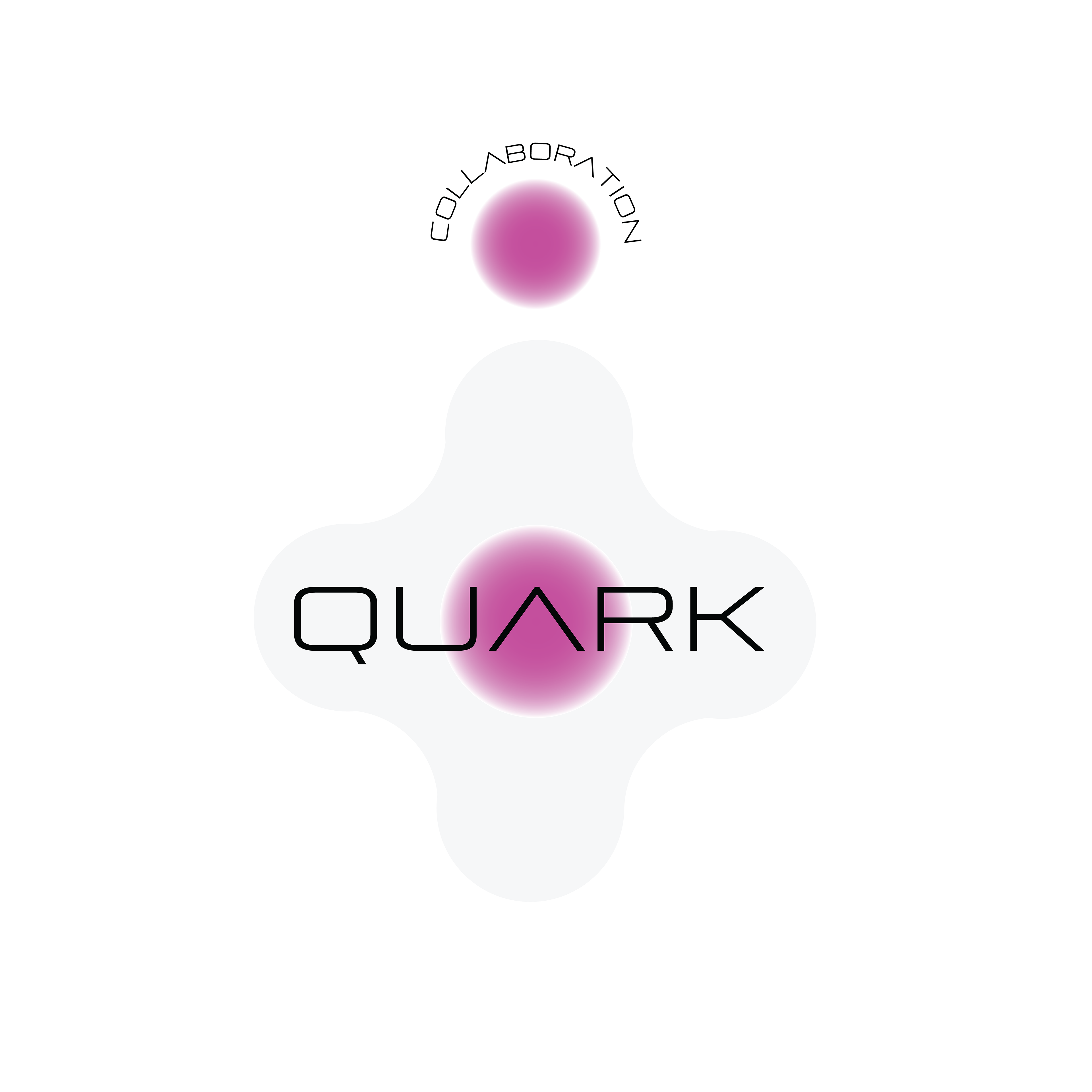
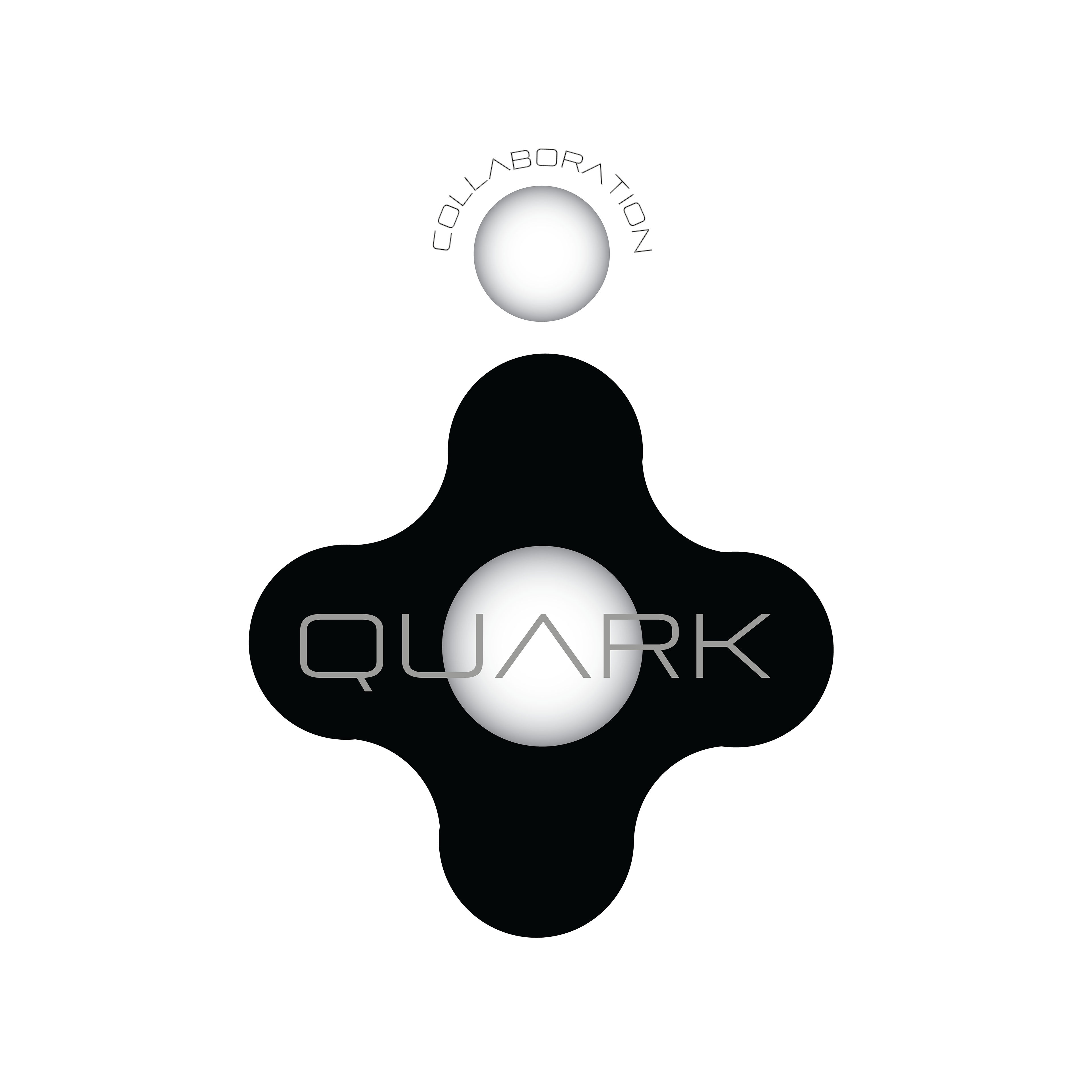
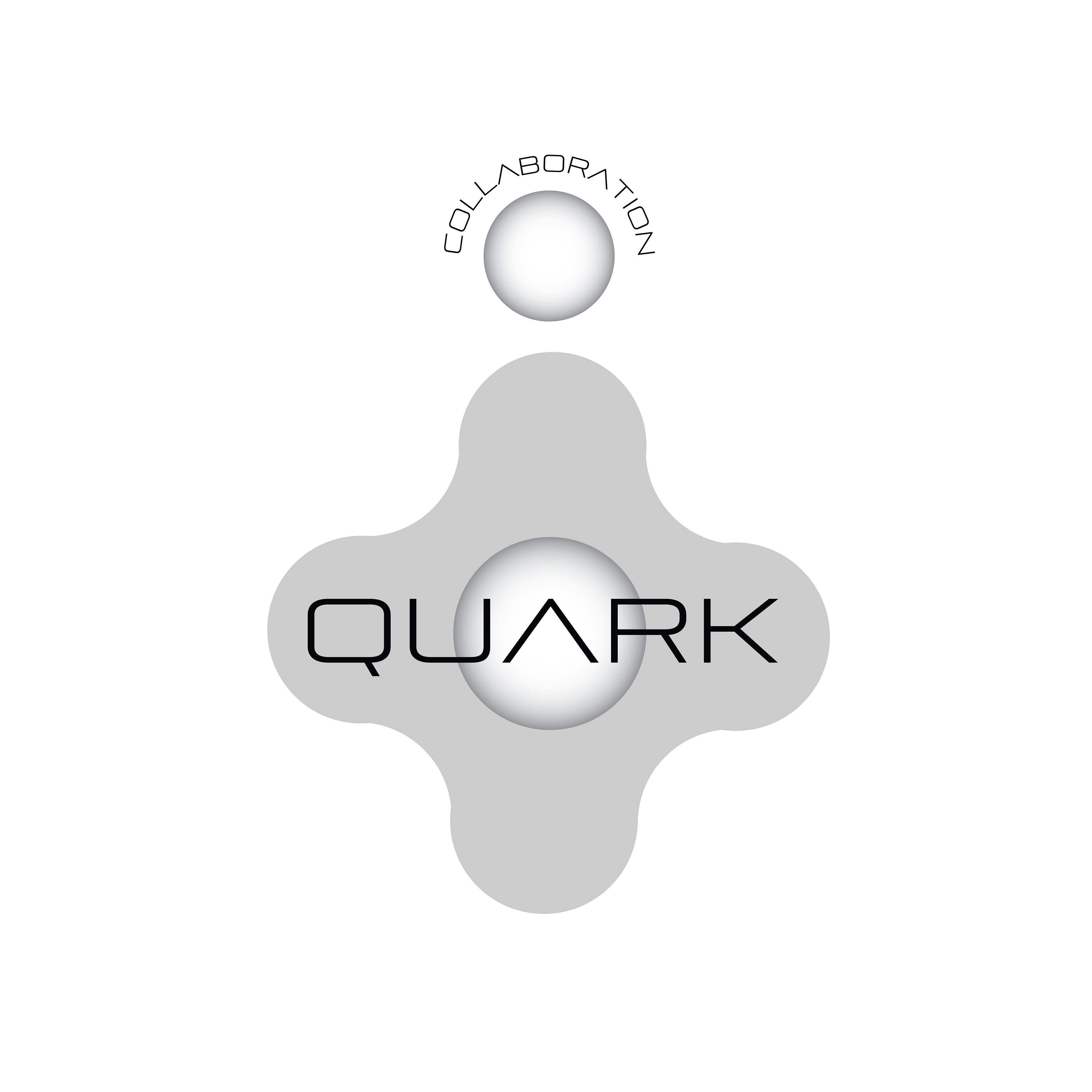
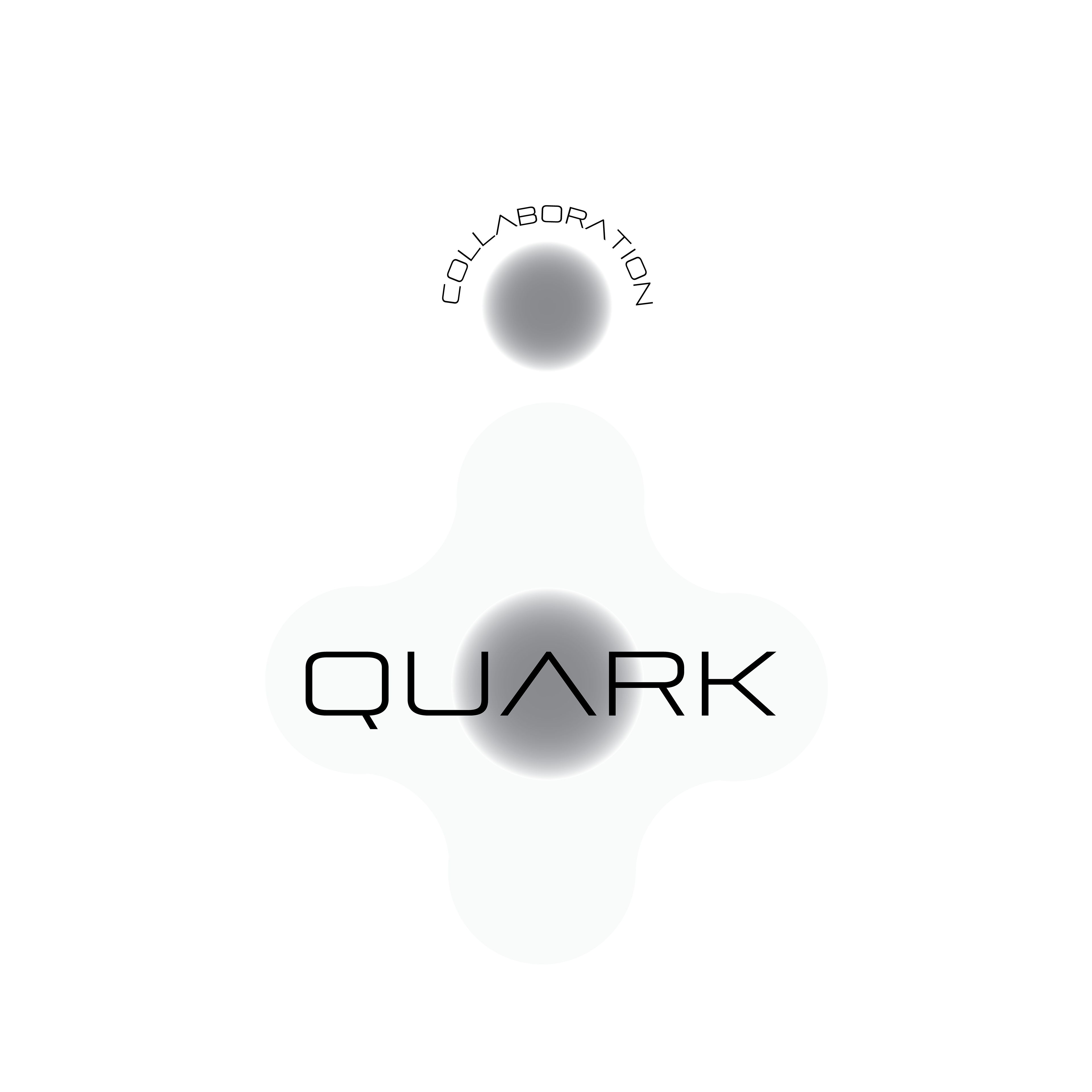
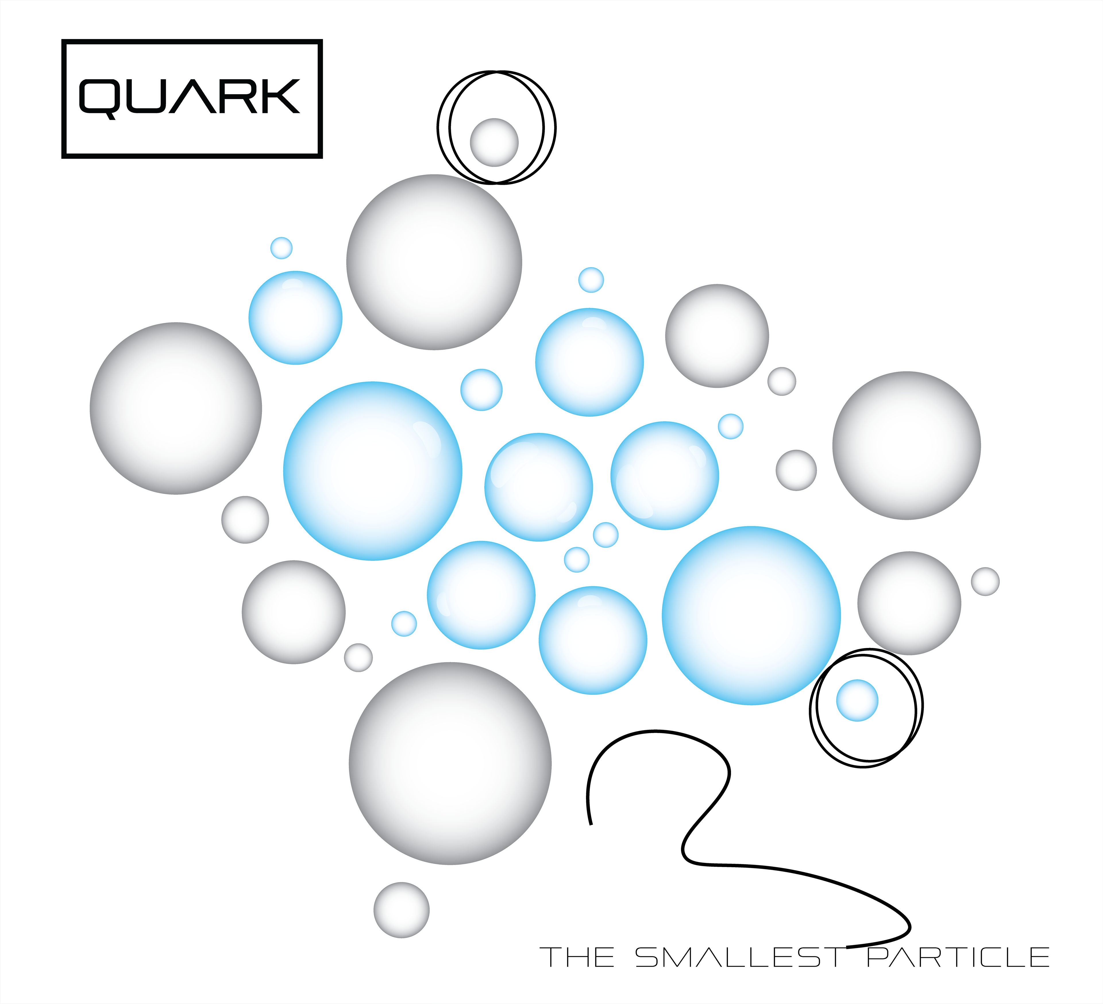
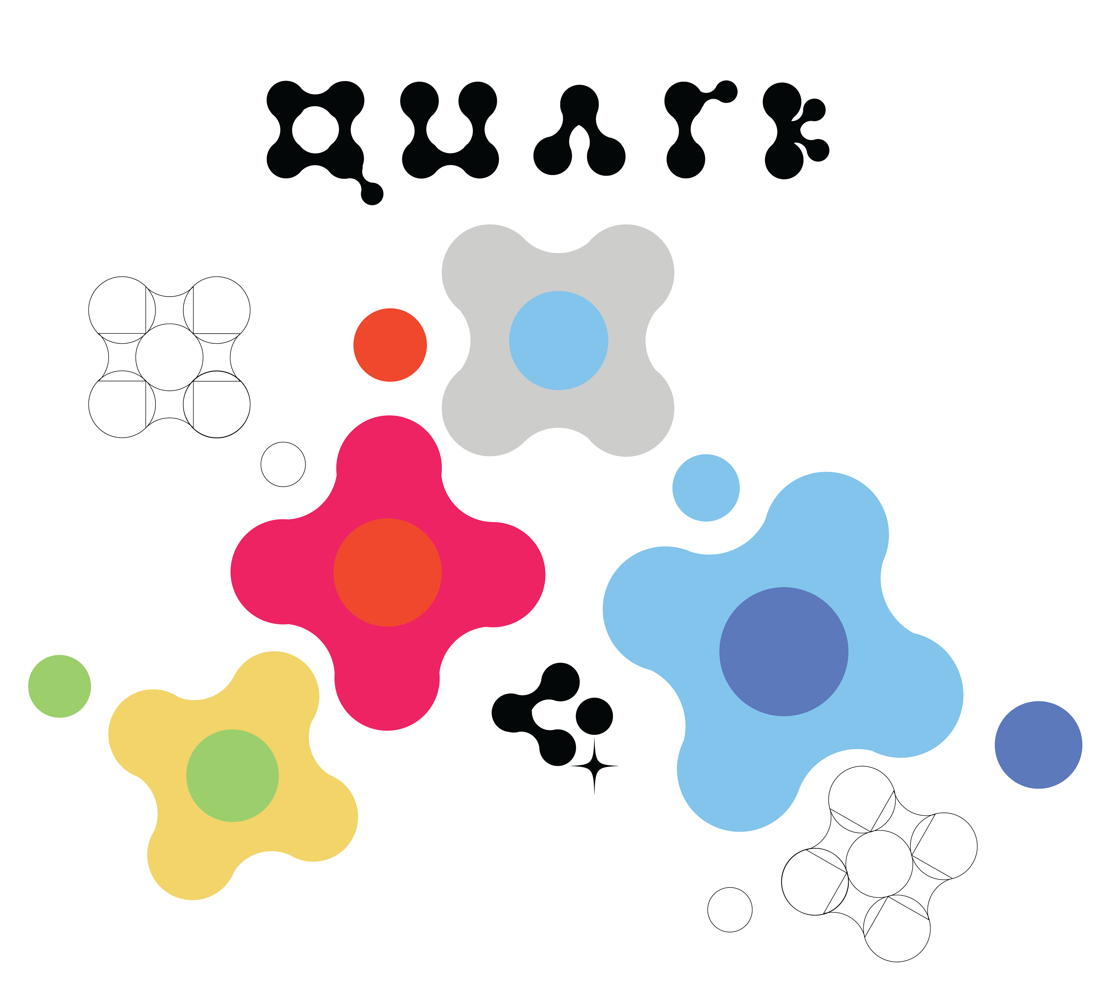
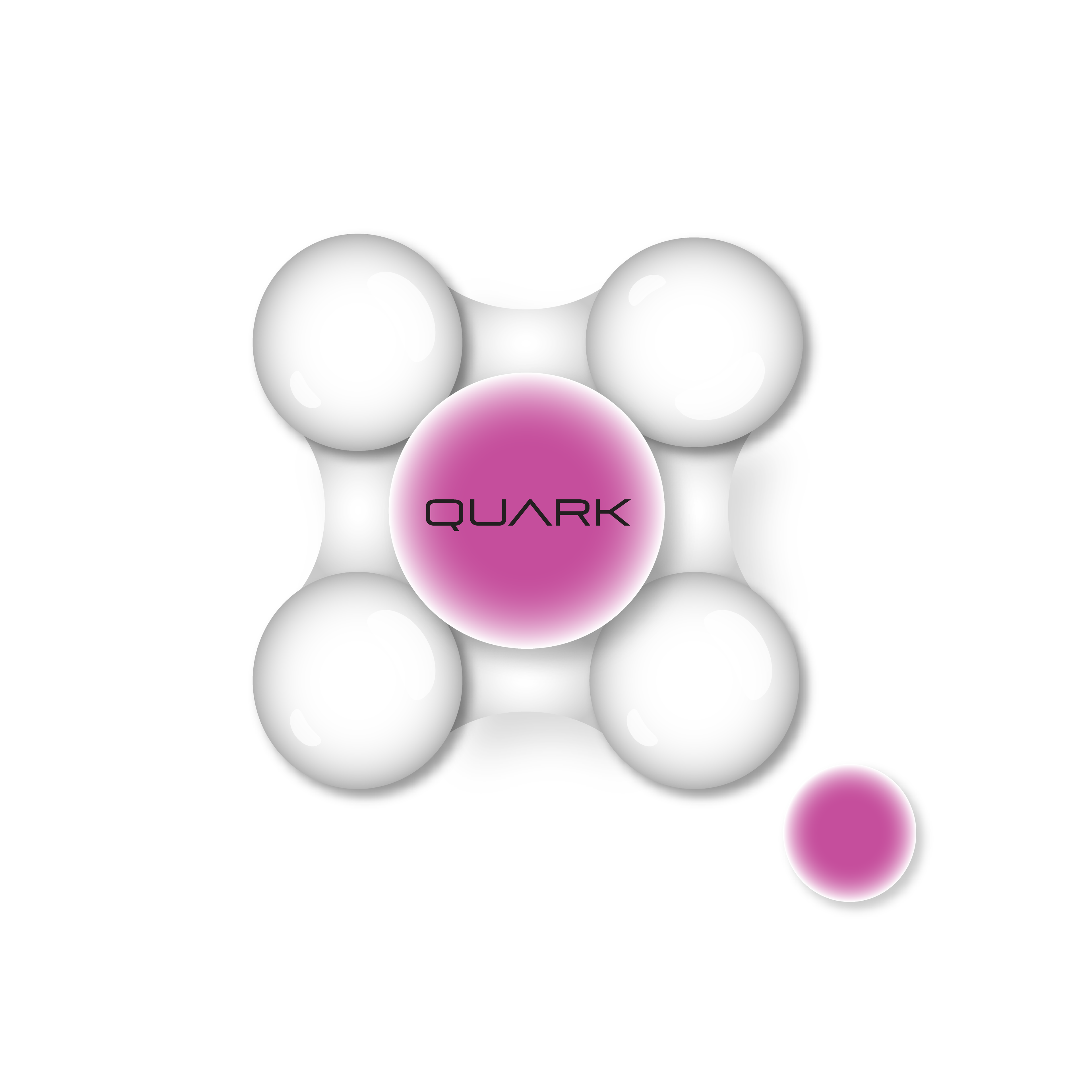
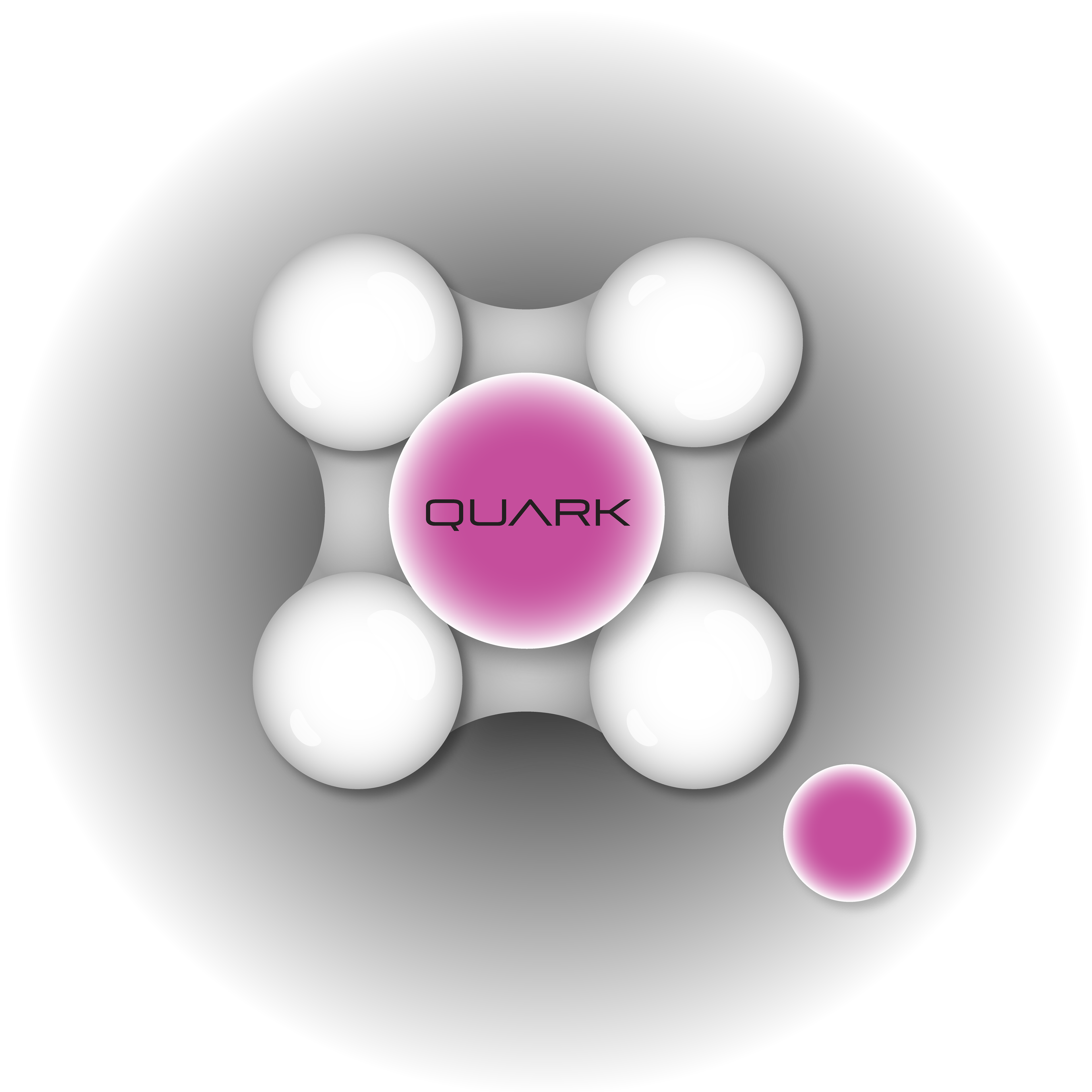
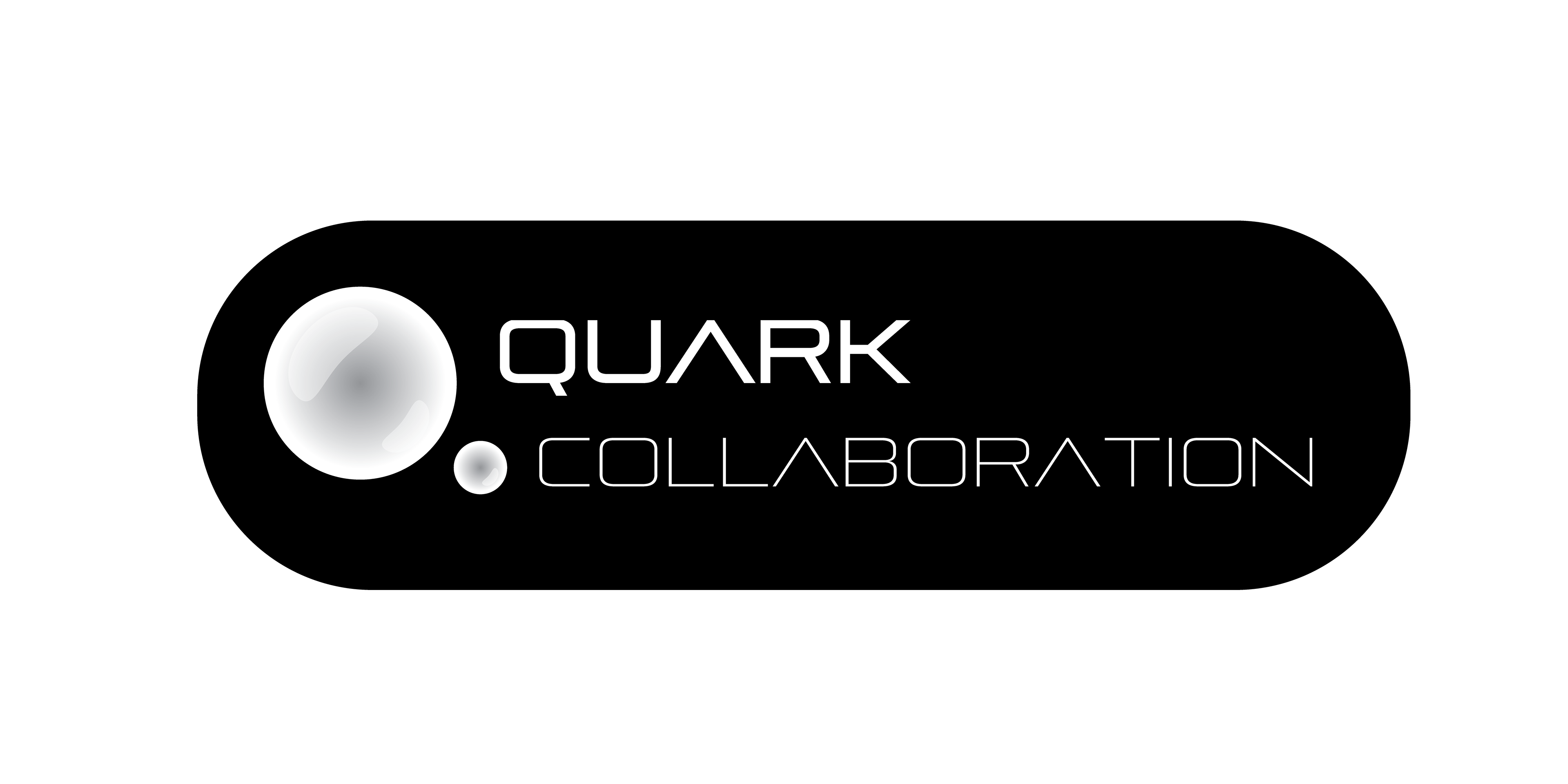
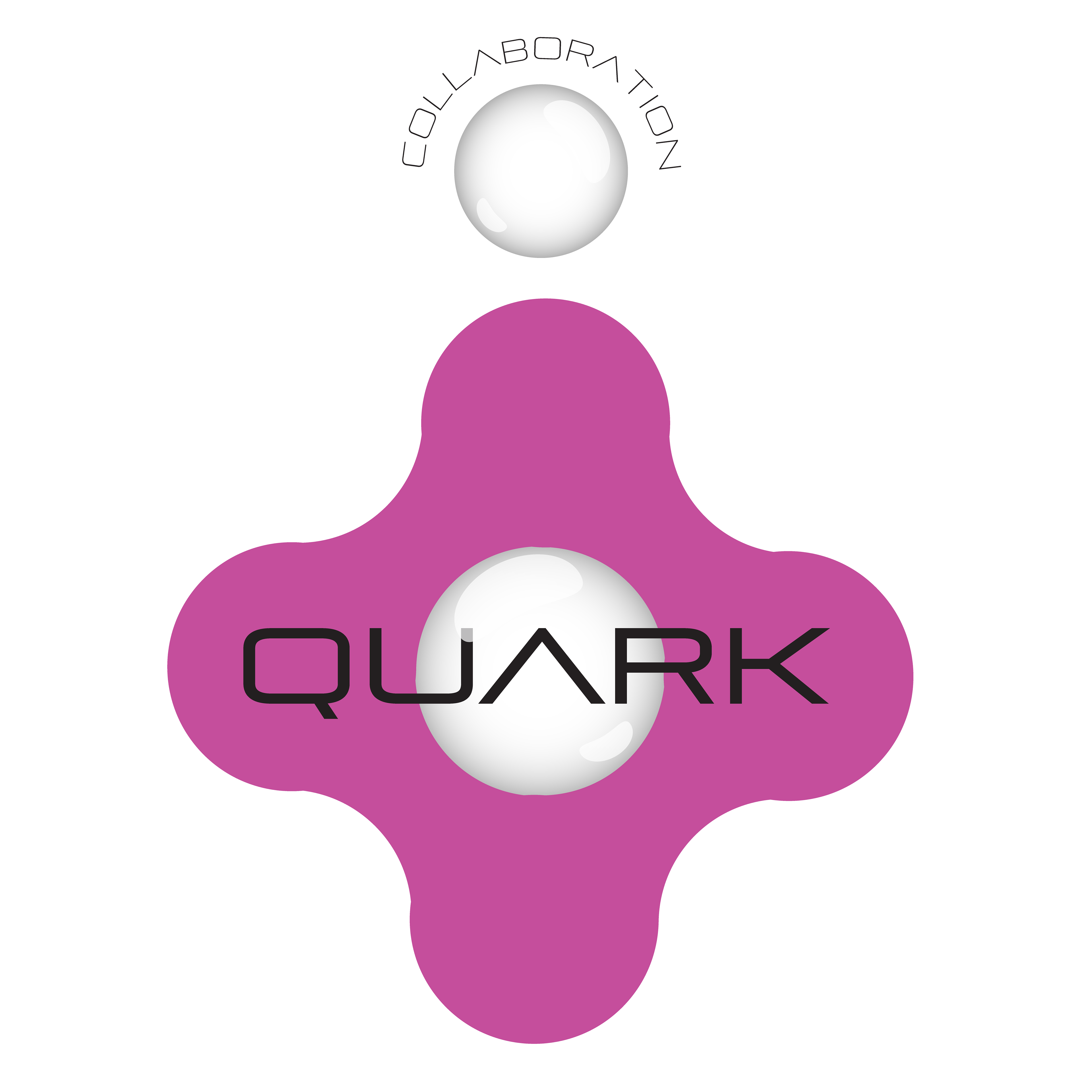
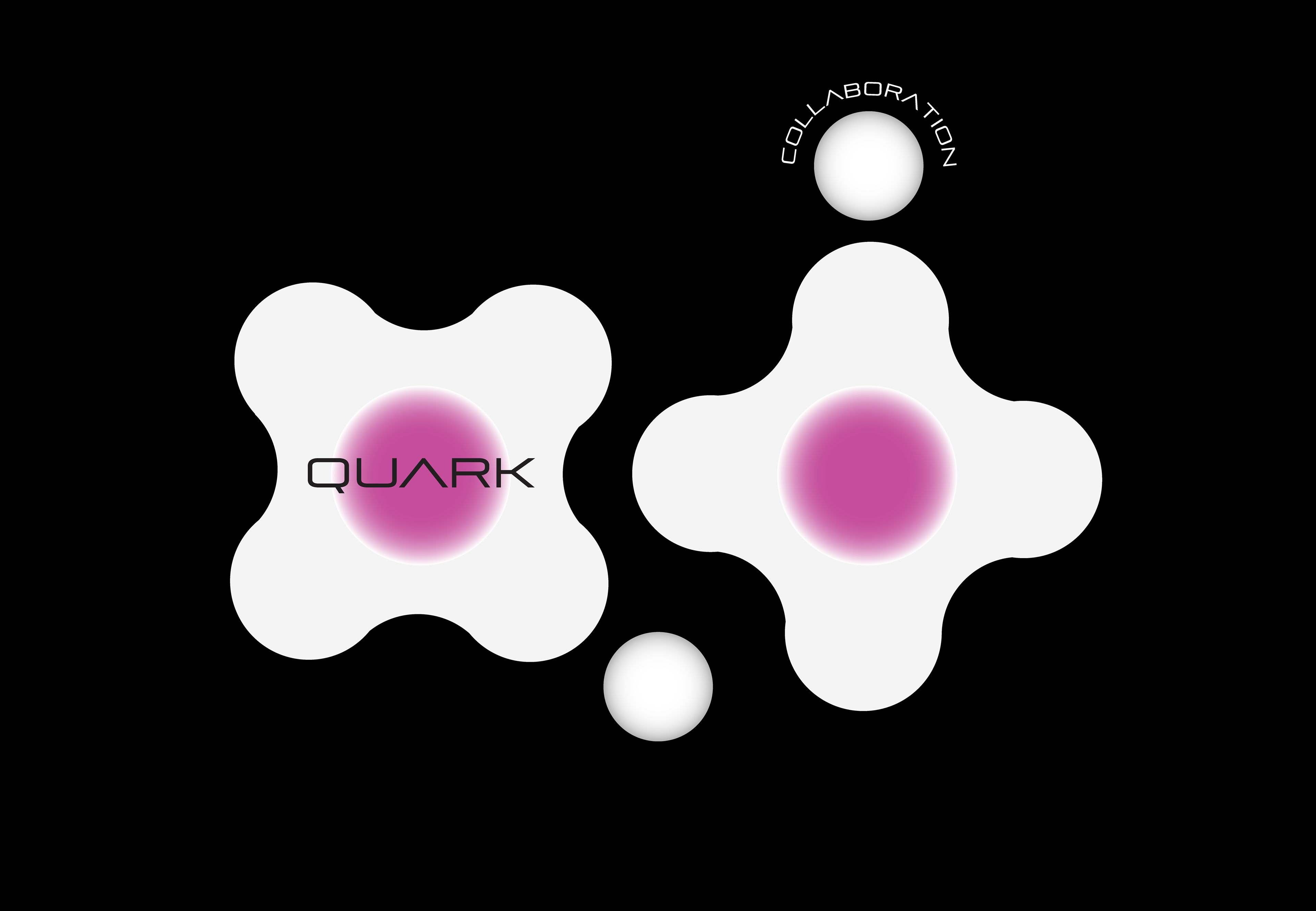
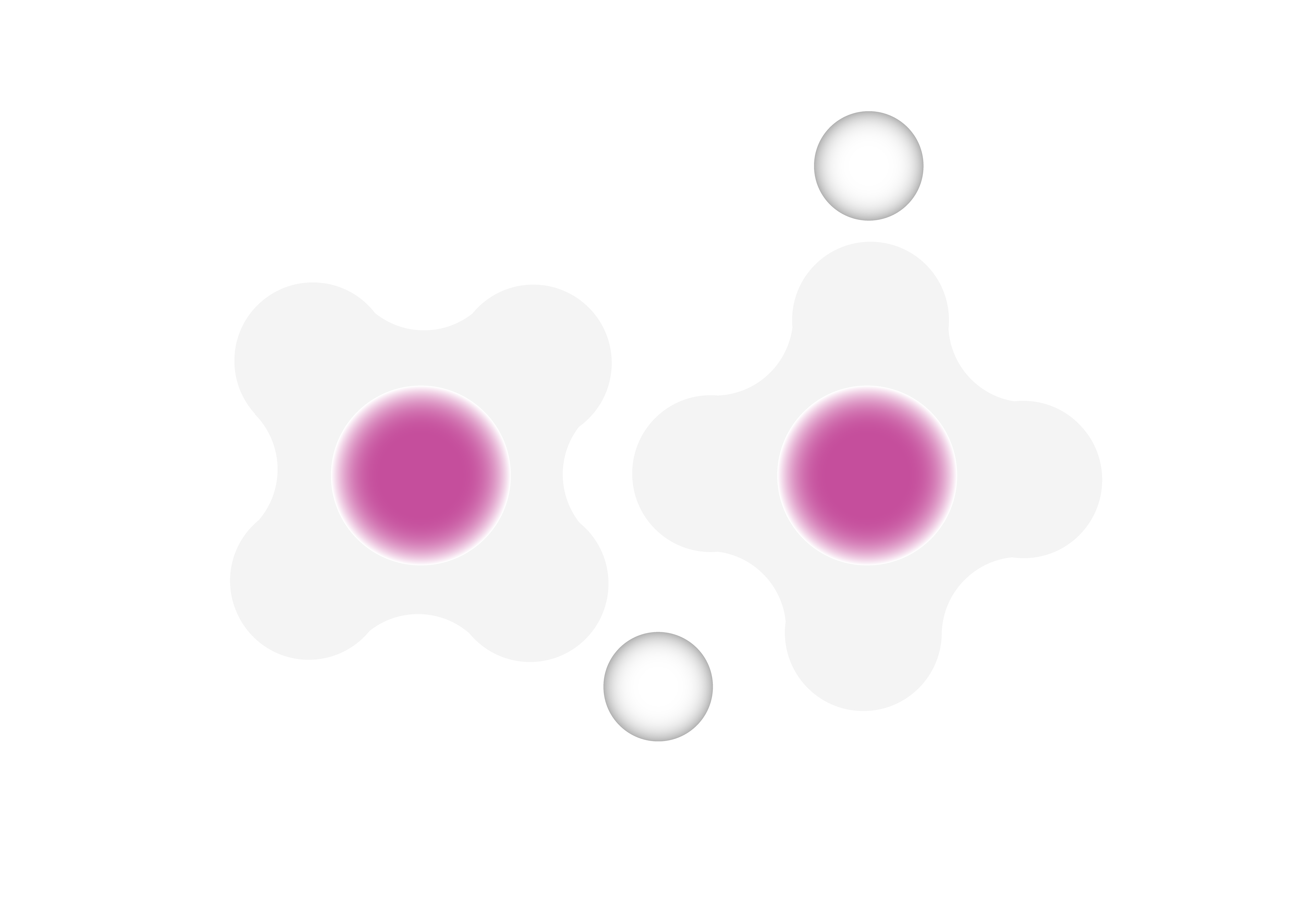
Role: Graphic Designer: Logo Design, Branded Concepts for Website and Business Cards – Designed representations of movement and connection between orbs to reflect the elaborate world of neurodiversity, specifically of the mind, through the world's smallest particle: a quark
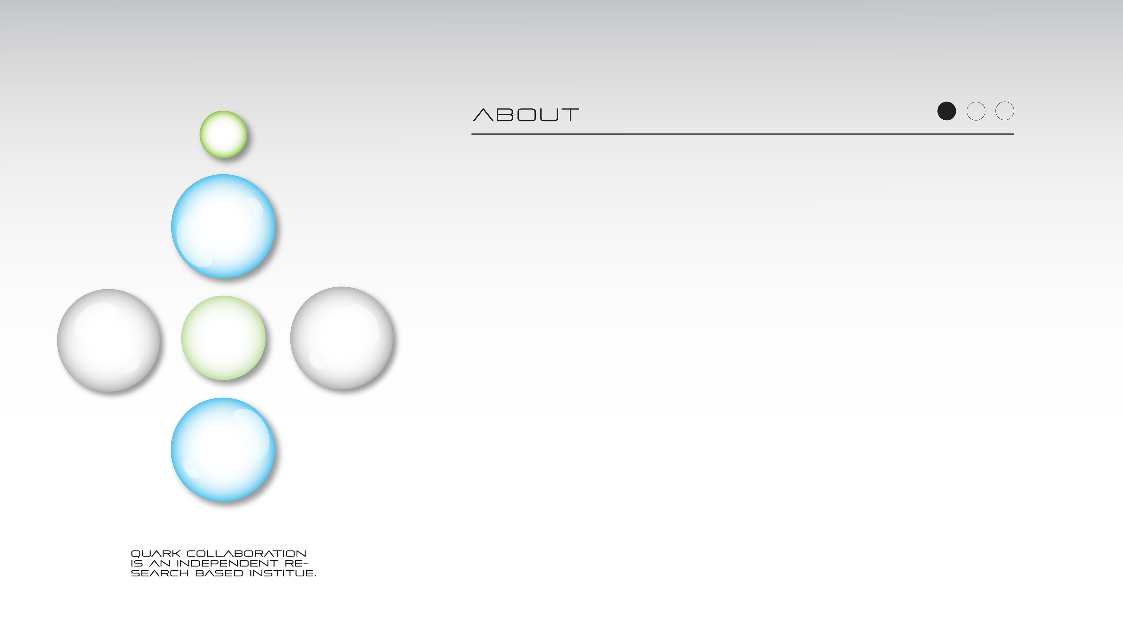
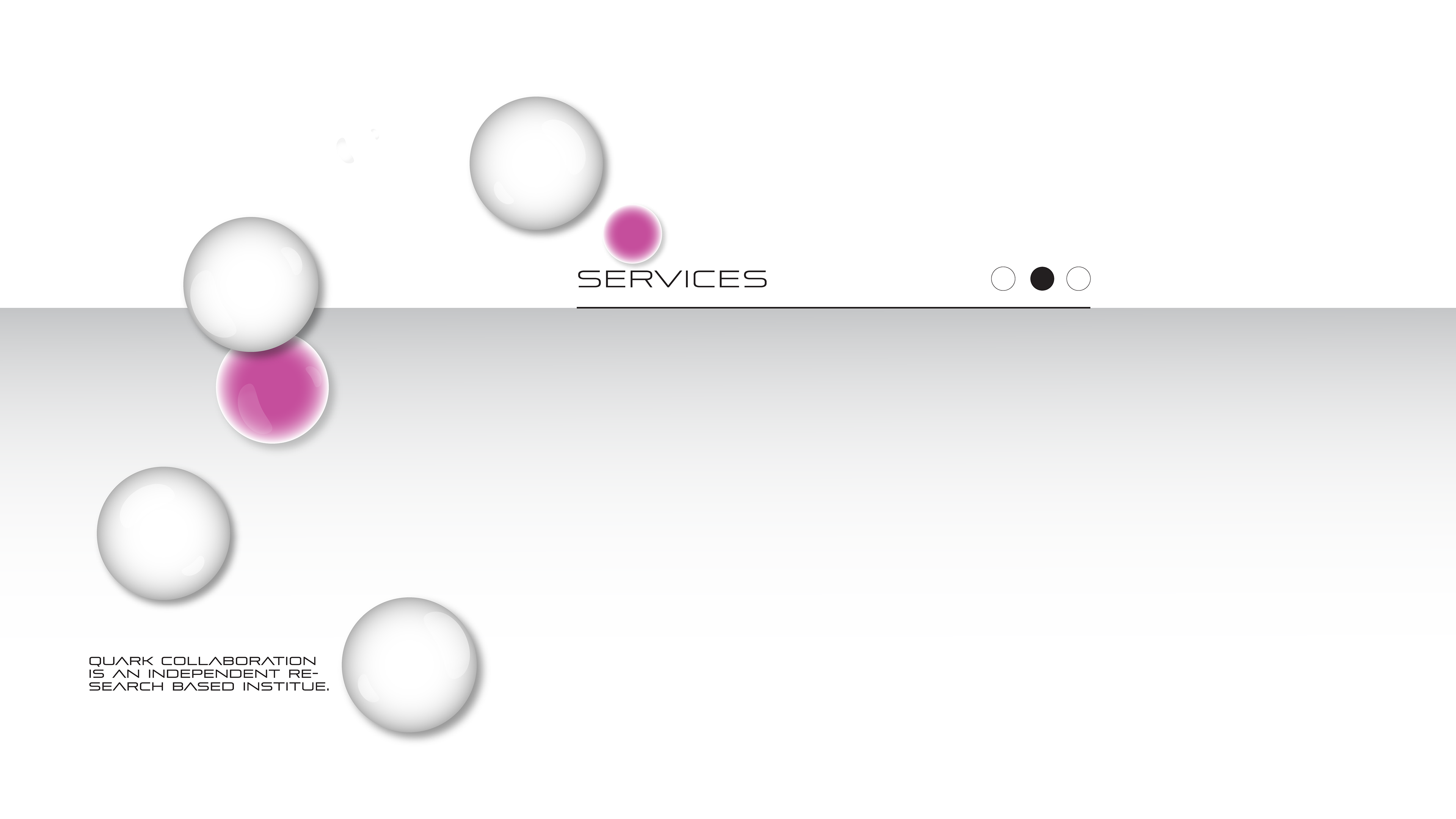
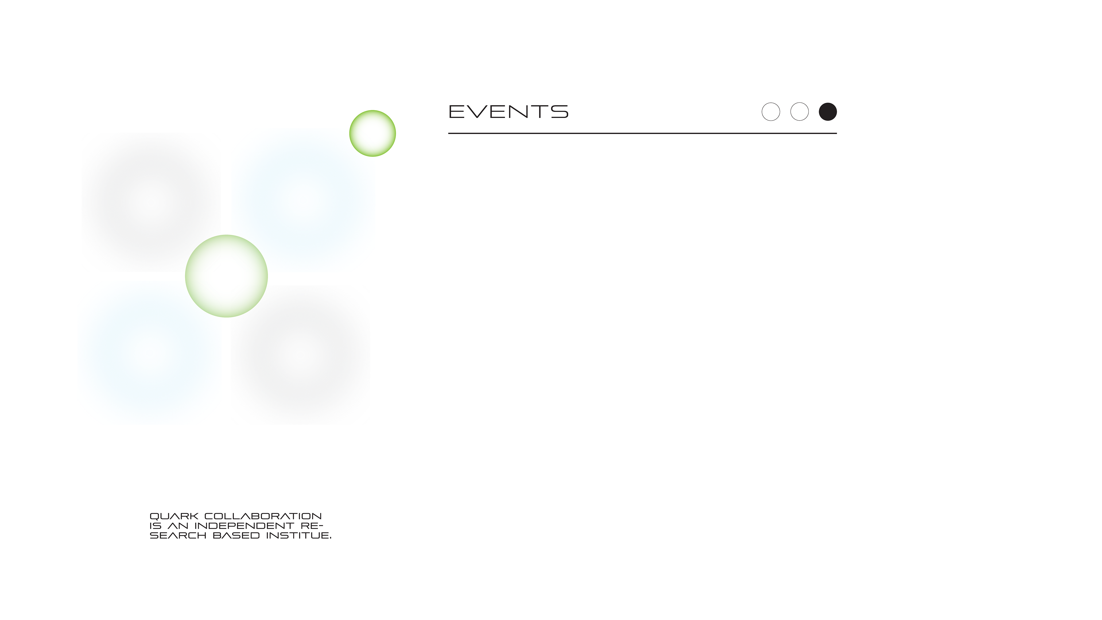
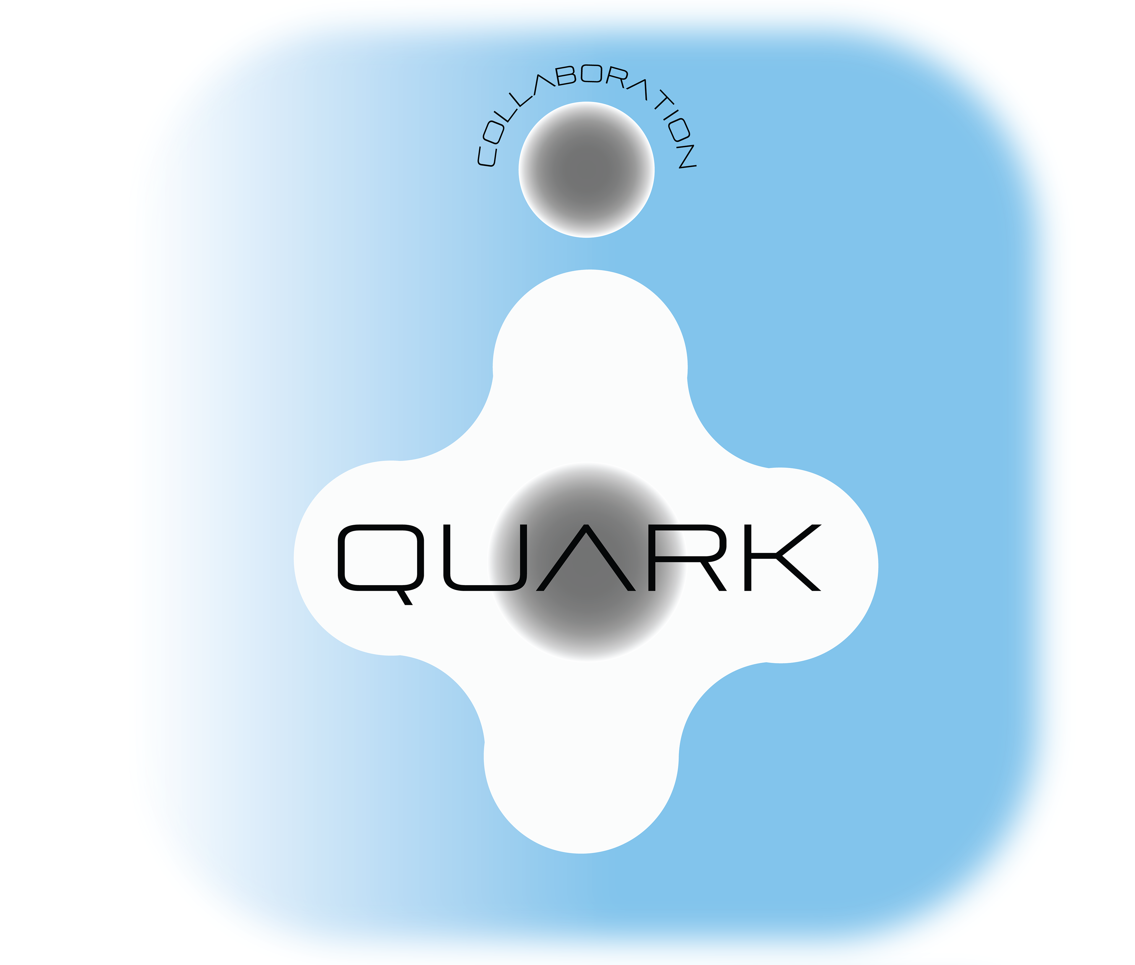
The logo functions visually as a capital letter Q and a standing human form with adjusted logotype across graphics. Magenta is the key brand color for its speciality in not being found on the visible light spectrum, with black, white, and grey shades emphasizing fluidity through opacity and depth through gradients, seen come together in the main logo as a "3D" model
Worked directly with founding team of specialized educators in fields of gifted and talented, non-profits, and research. The team currently produces: Quark Collaboration VOICES: Podcast & Videos, celebrating neurodiversity through culture, cognition, and communication
Landing Page Visual, Web Specs, Digital Business Card and Physical Business Card as the Origin Point of Quark Co. Branding.