Exploring unused prototypes to develop the visual brand identity for an emerging research practice. The company, “much-room”, also operates under the shortened moniker, “mu-ro", and focuses on the growth of human perspectives.
Process: up-cycled prev. unused design prototypes
Application: elements drawing out brand identity system, website, and collateral


A Re-Directed Production Company’s Debut – Case Study
I extended unused prototypes from a client proposal of which I have full ownership - to develop the visual identity for a research practice emerging in 2025 backing new methods of enhanced sensory interaction.
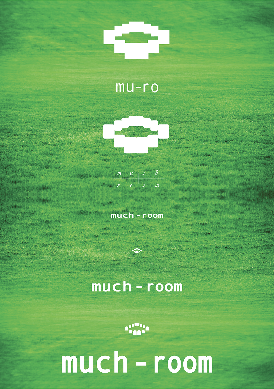
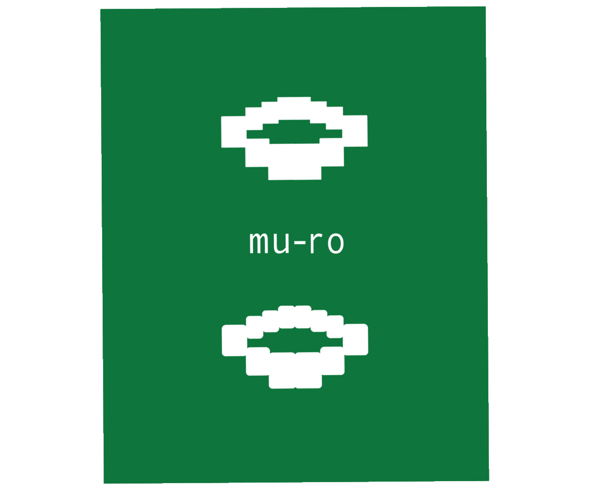
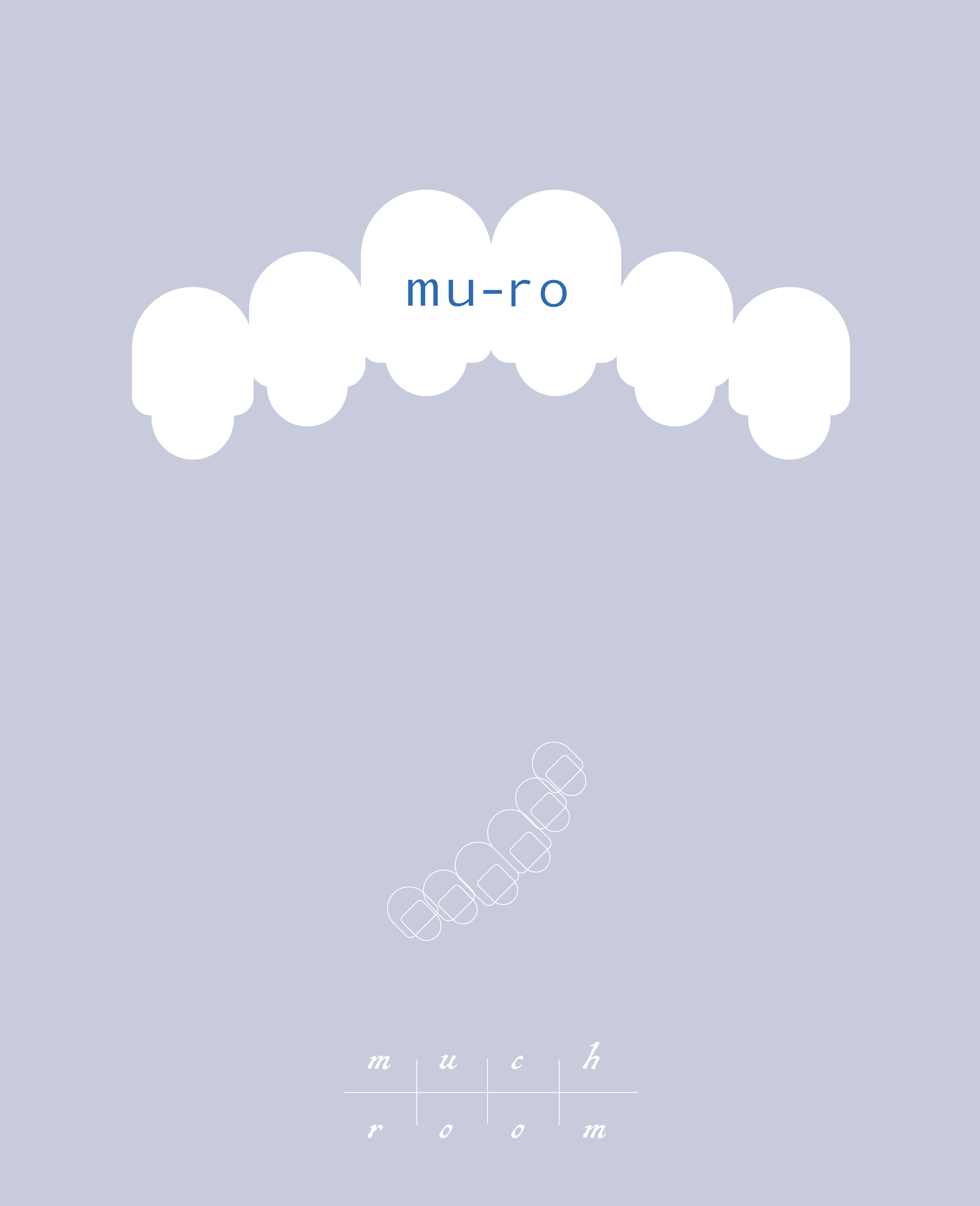
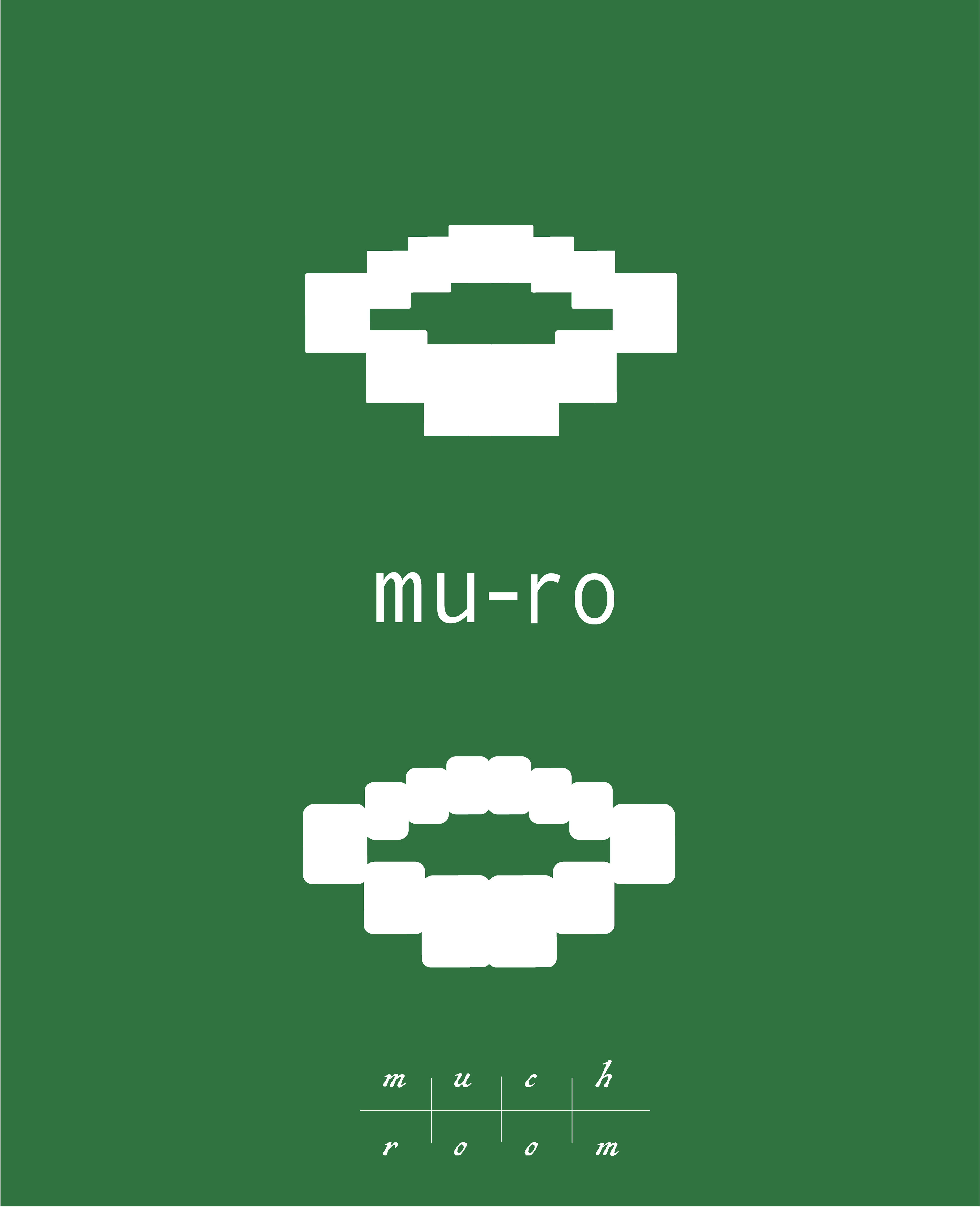
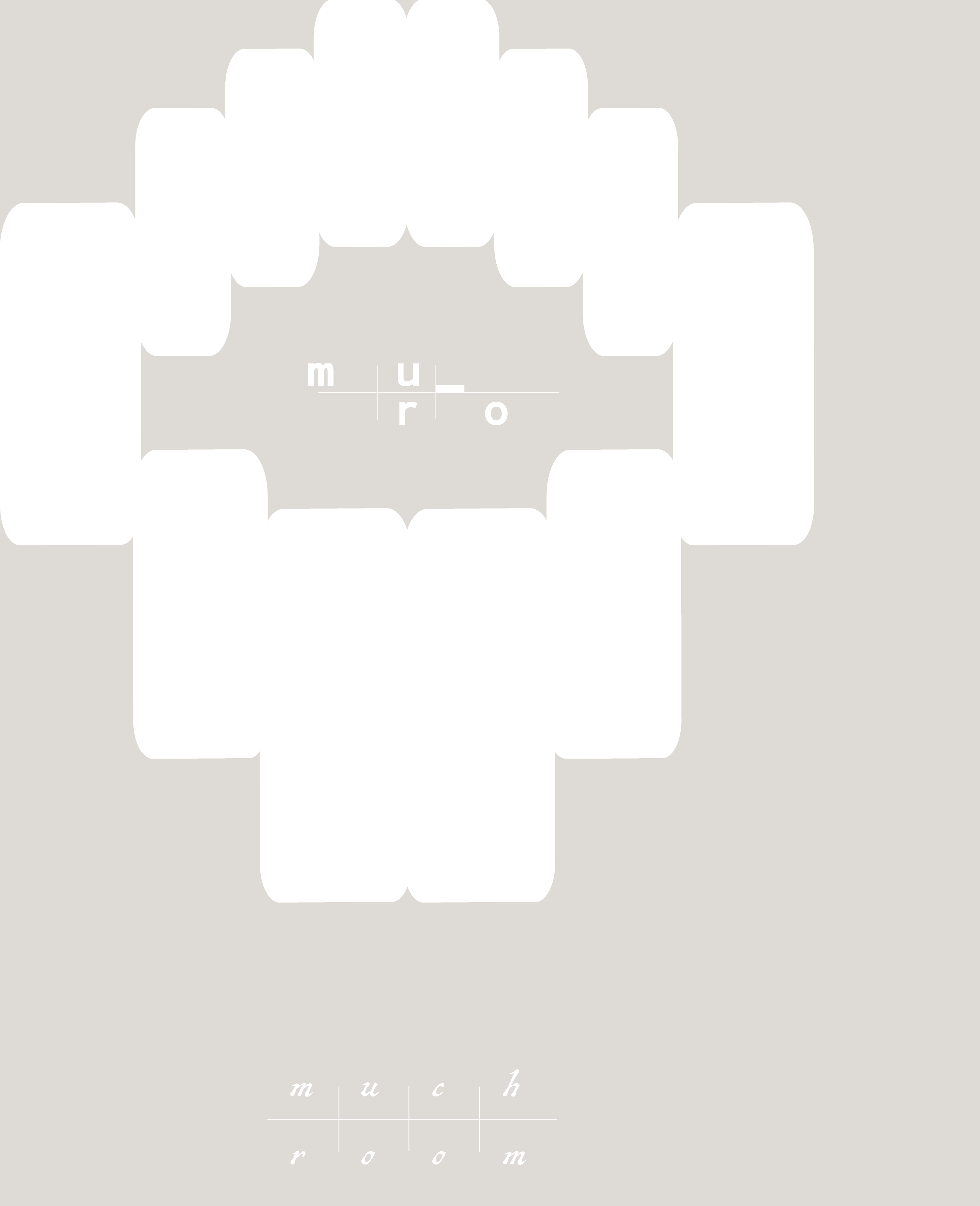
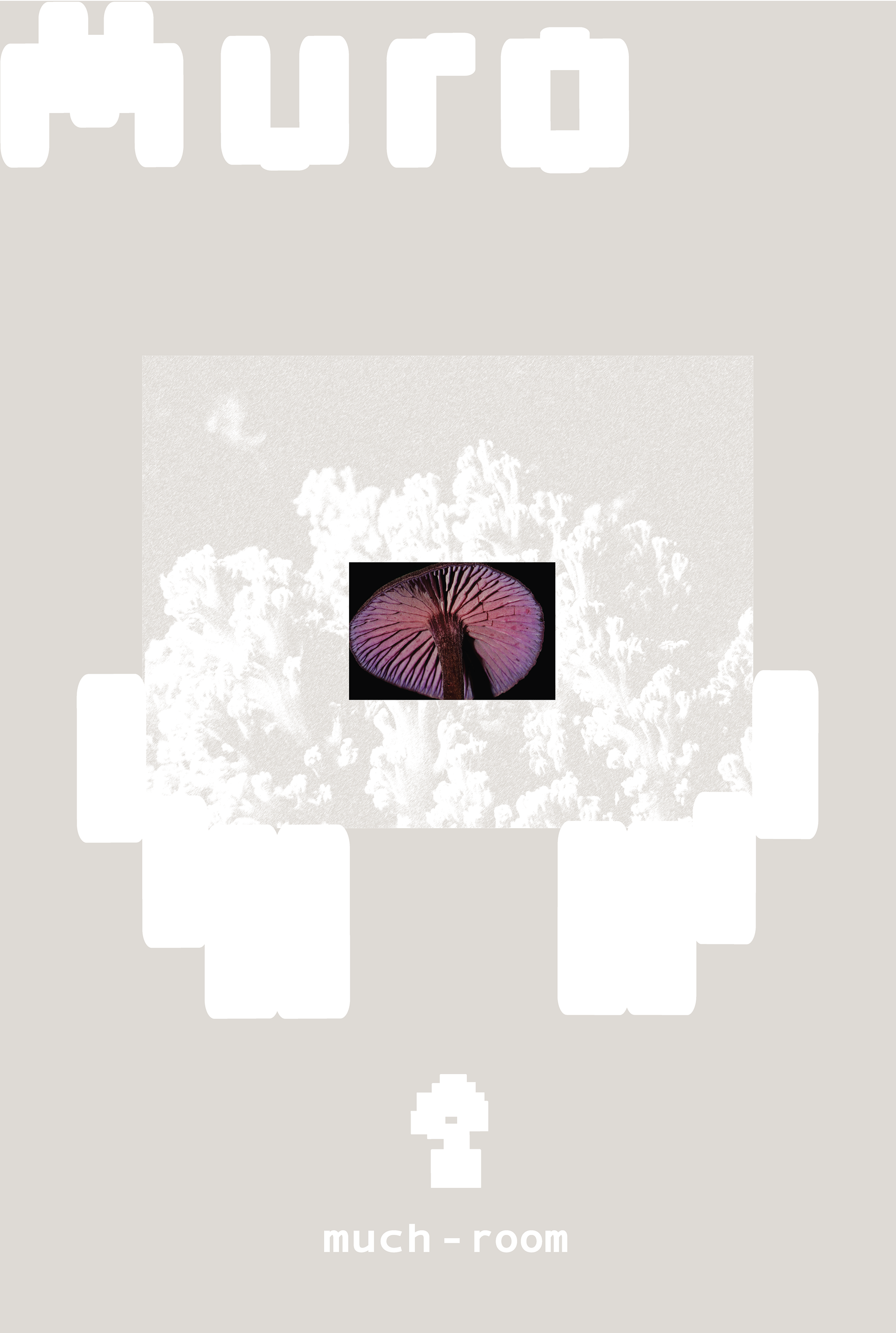
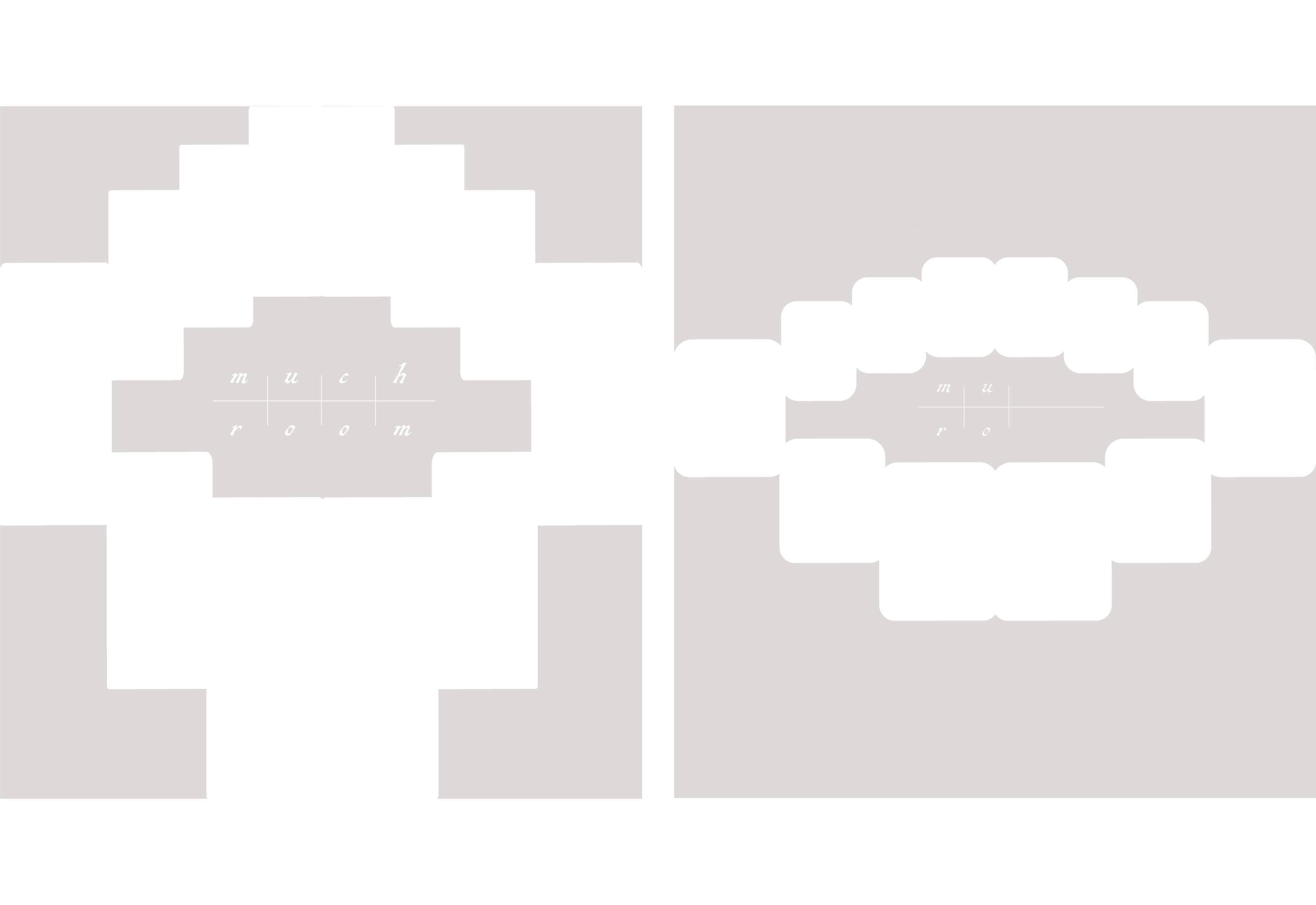
This study is a branding system for a company named “much-room” which also goes by the shortened name, “mu-ro".
Research & Strategy –
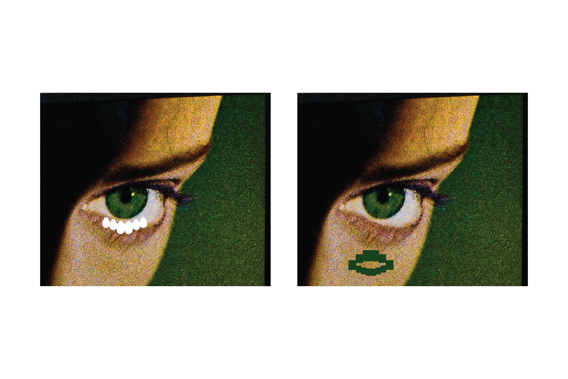
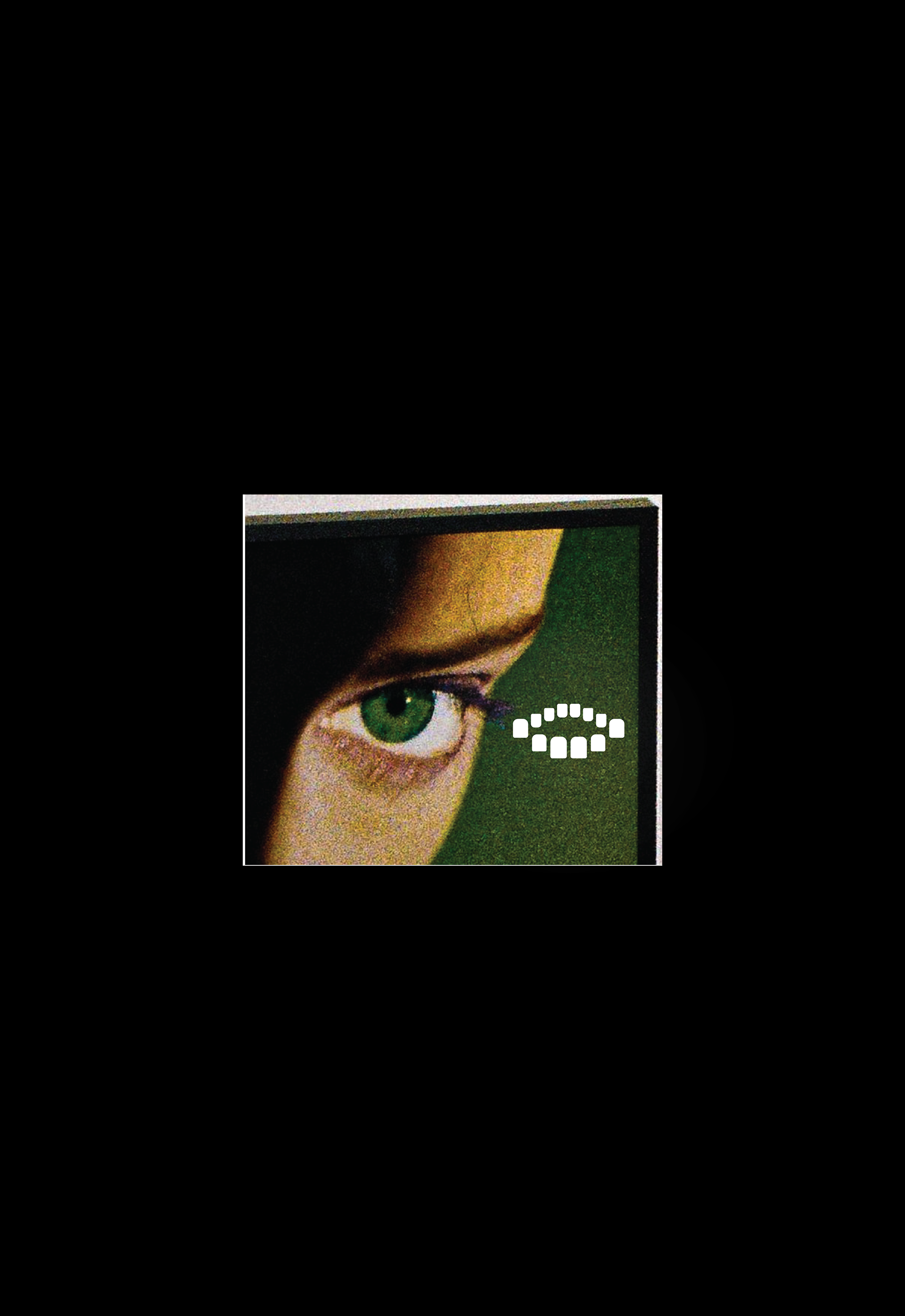
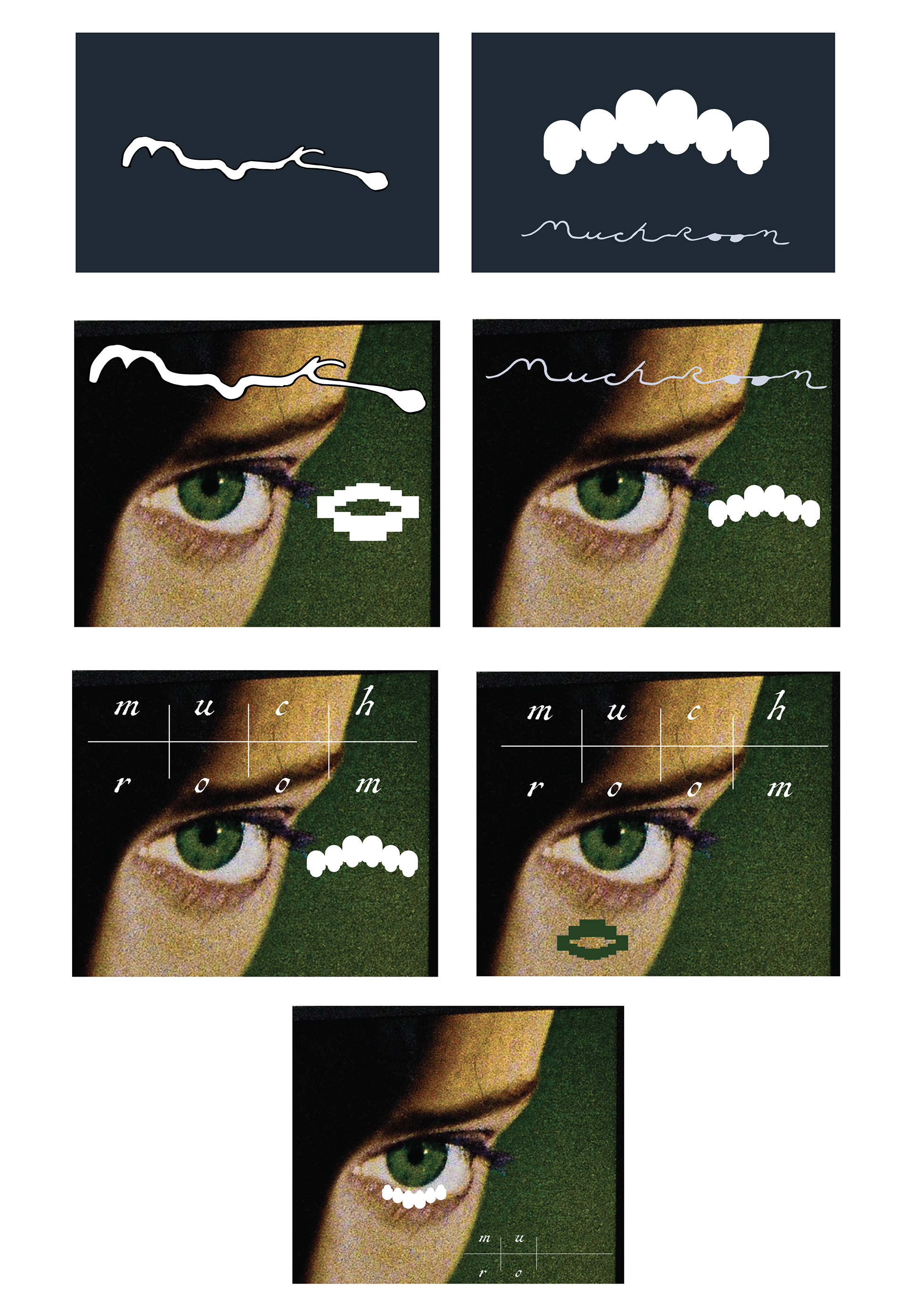
I approached the branding by sourcing a key reference: Roundtable Productions Logo (Color), (In B&W), a Production Inc. in the creative field that reflects a structured yet passionate expression, comprised of a circular shape formed by smaller ovals with the company name in the center. A component of "mu-ro" is to look at, observe, as likened to the spanish word "miro", and the idea of forming shapes that resembled an eye became vital to the brand identity. Additional research I explored was in gaming interfaces and digital devices such as the Game Boy, finding a strategic approach in companionship, such the idea of a pixelated character that is magnetic and ever-forming to ones expression; as reflected and comprised of points of data. .
Positioning –
- Growth, fruit-bearing
- Experimental, out of the box
- Homemade yet sturdy
- Familiar yet otherworldly
Early Concept Rounds –
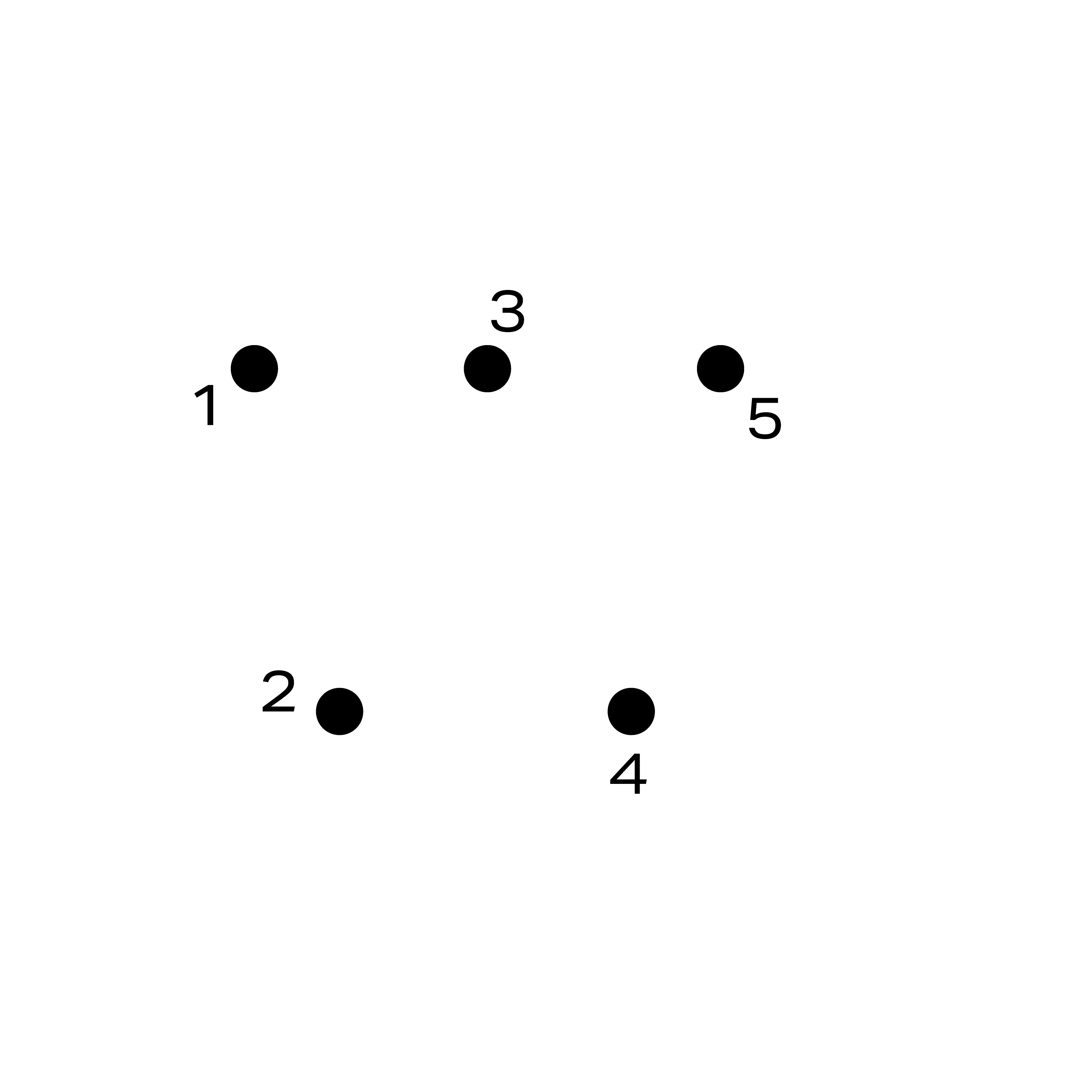
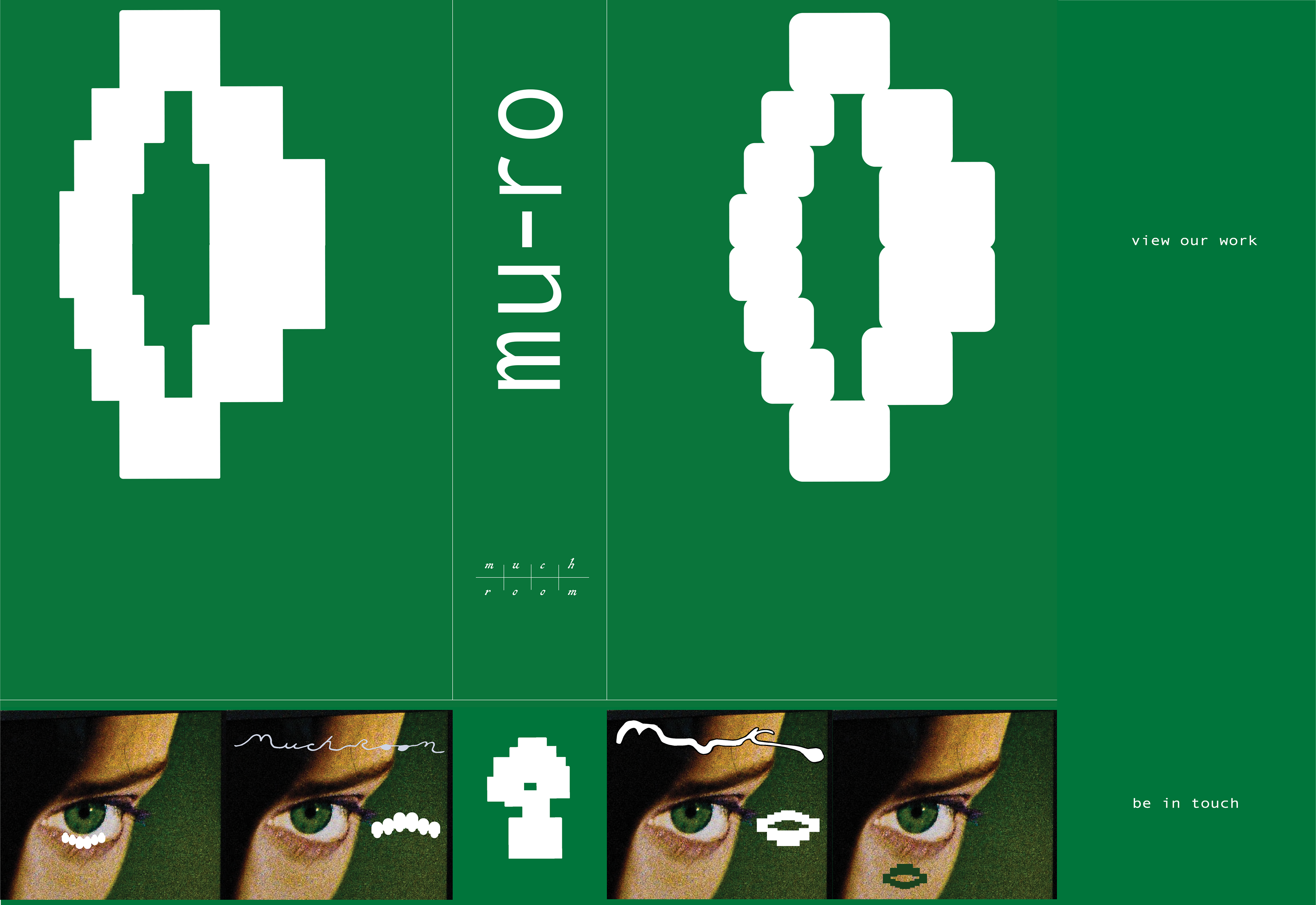
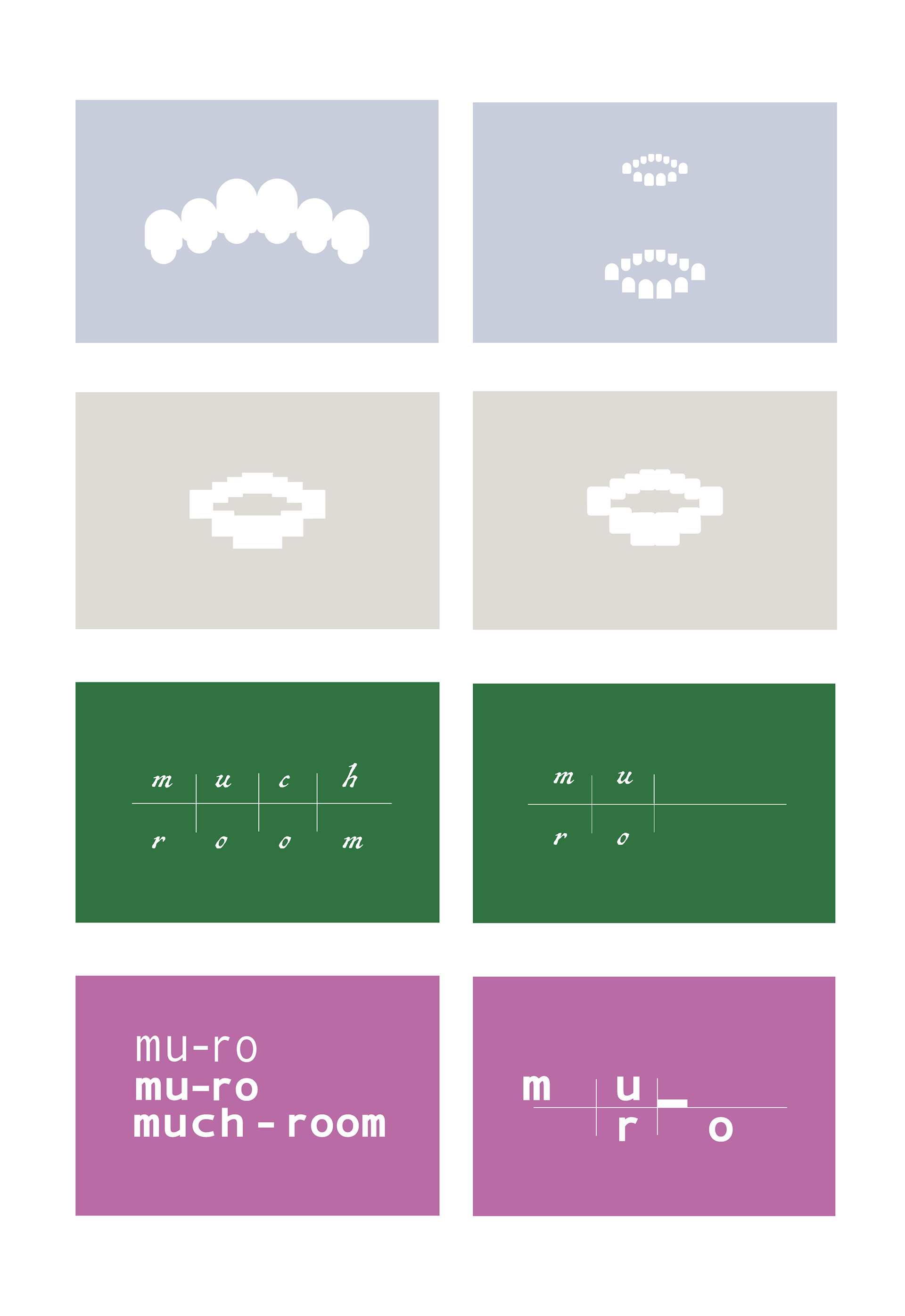
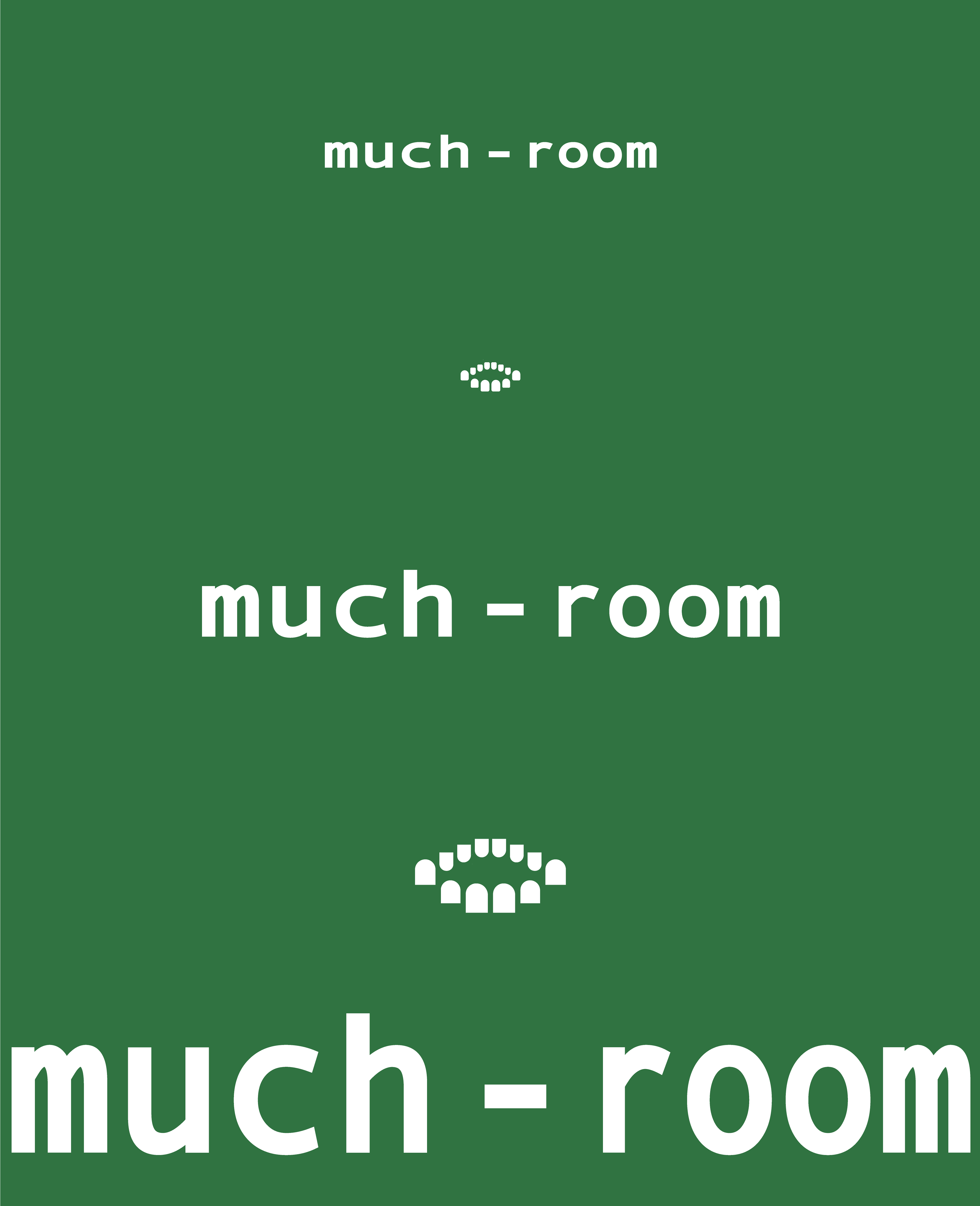
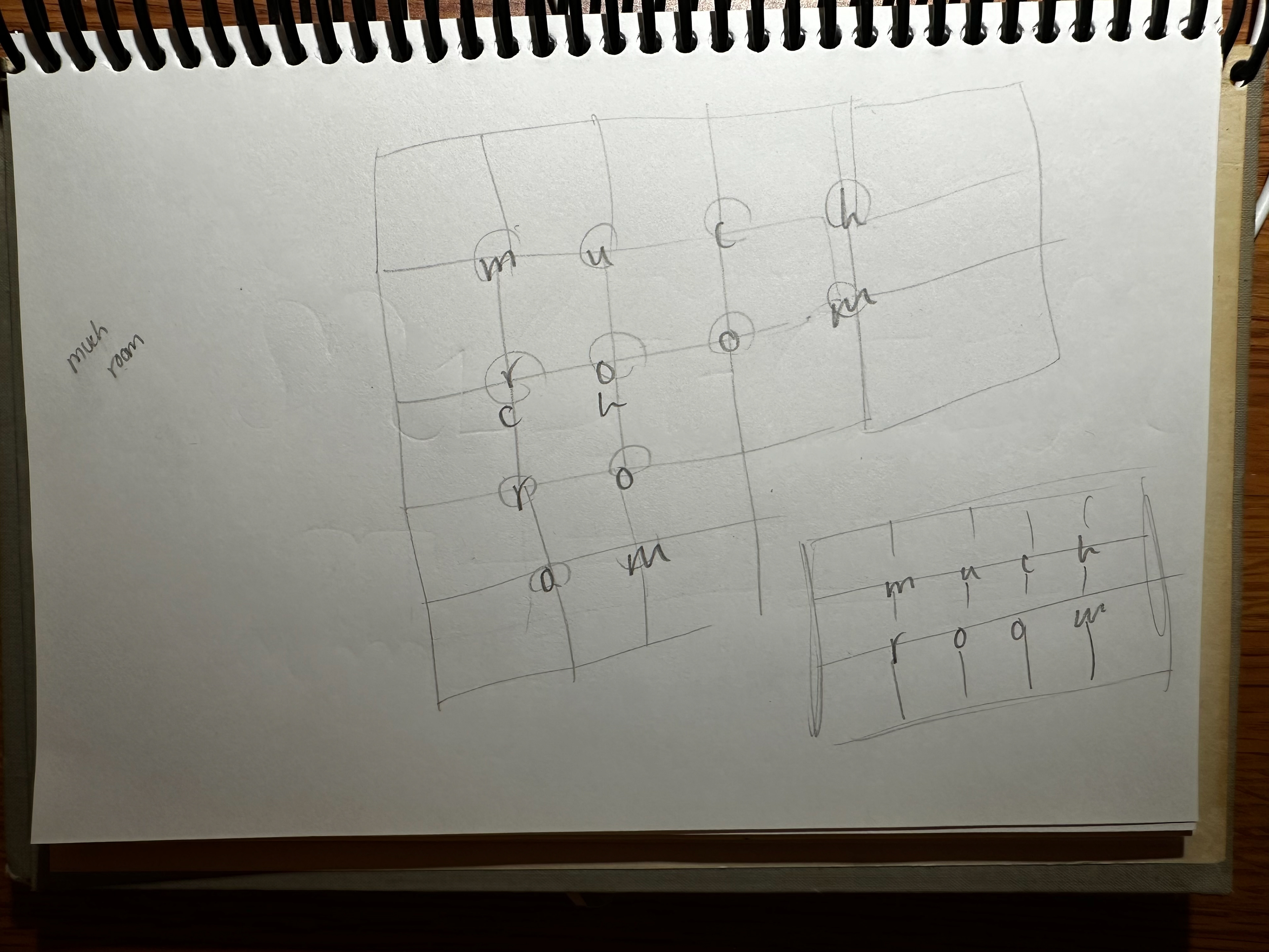
Sketches of the logotype and additional type designs can be found at the end of the study. I referenced mathematical proportions and the nature of matrices to develop the "much-room" and "mu-ro" grid assembly that fit the letters perfectly, by fact of having 8 and 4 letters respectively. Accompanying type forms are handwritten to embody the humanity behind the work; and the sans-serif font is a key playground of how the name is read, I wanted a type that could stretch and grow, putting an emphasis on open space visually read.
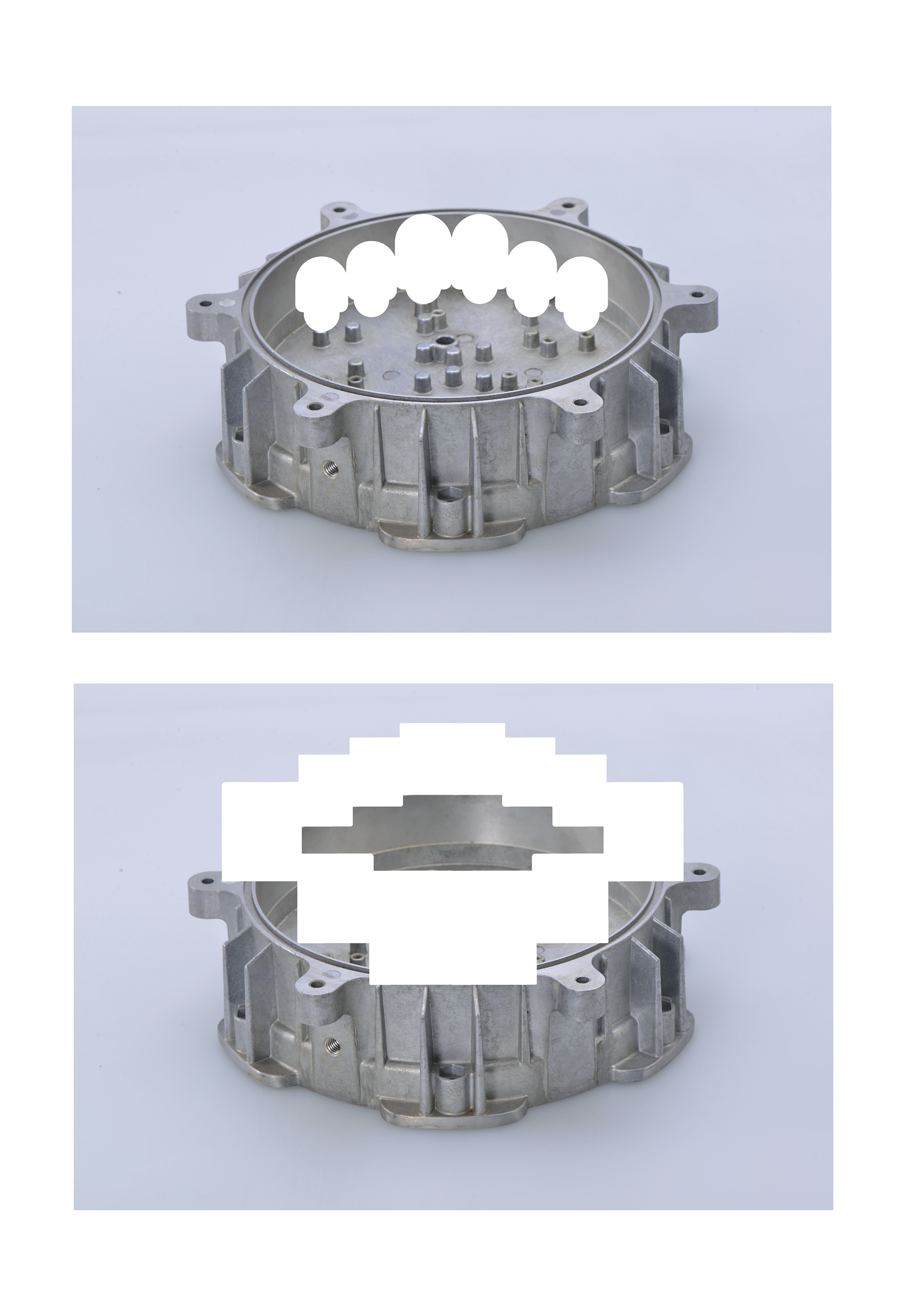
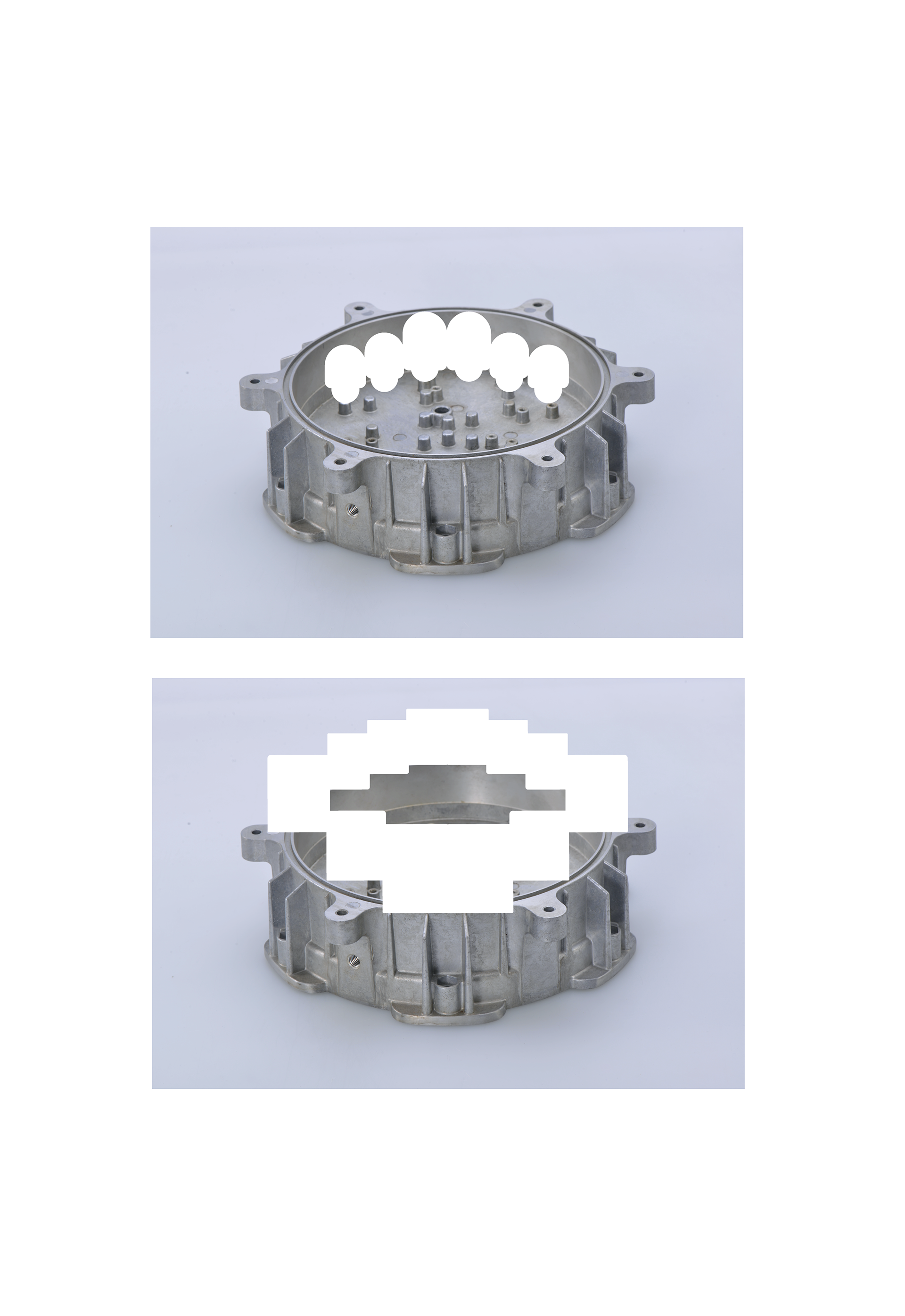
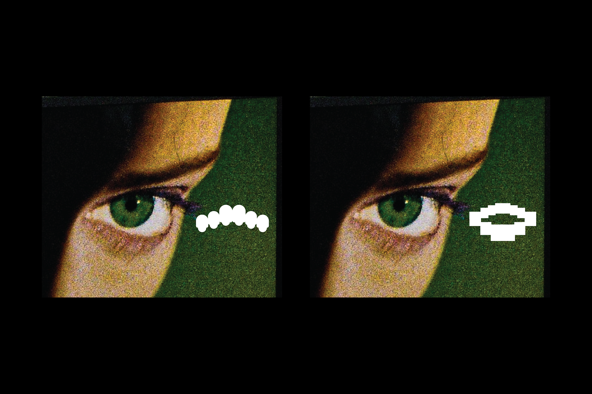
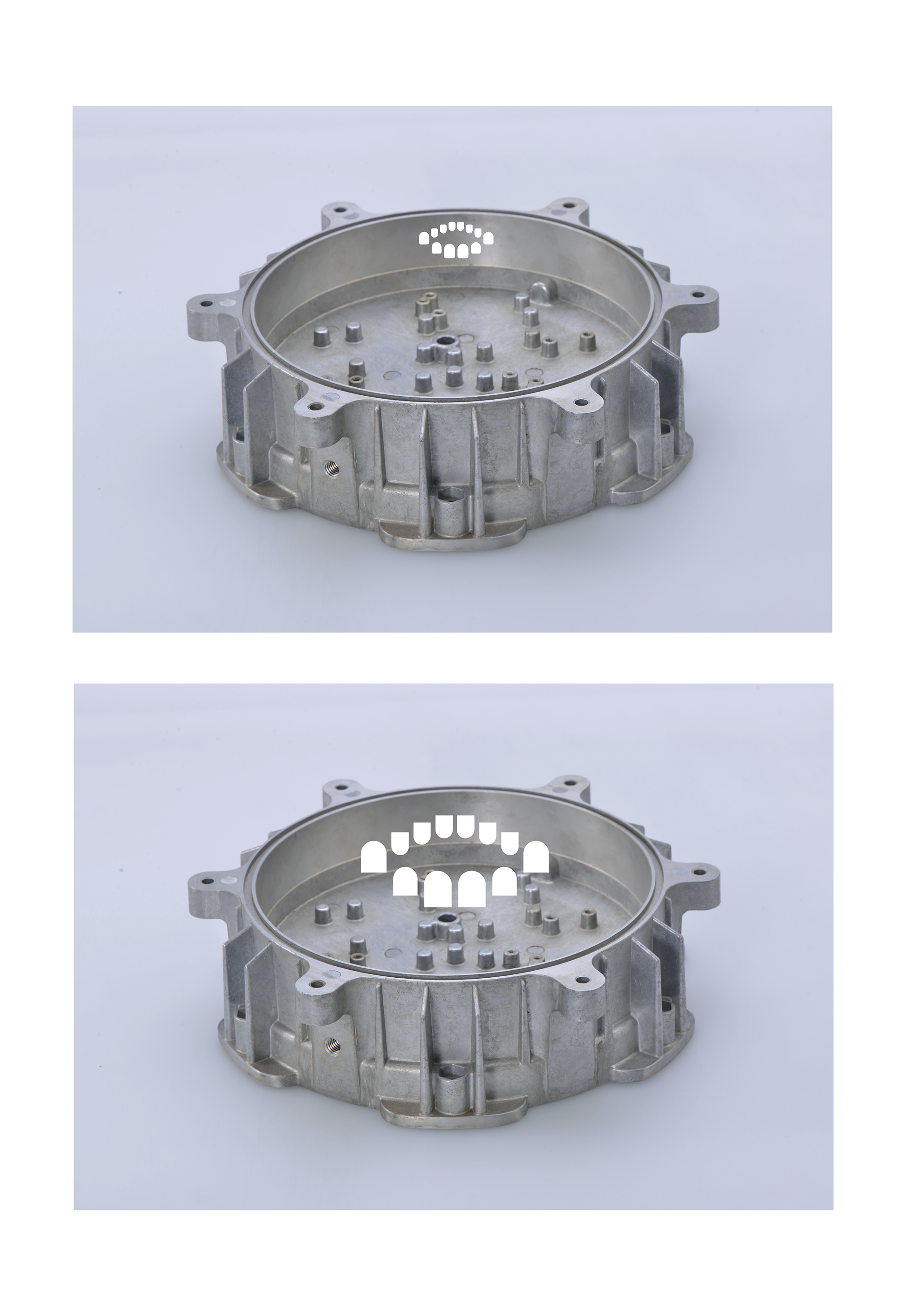
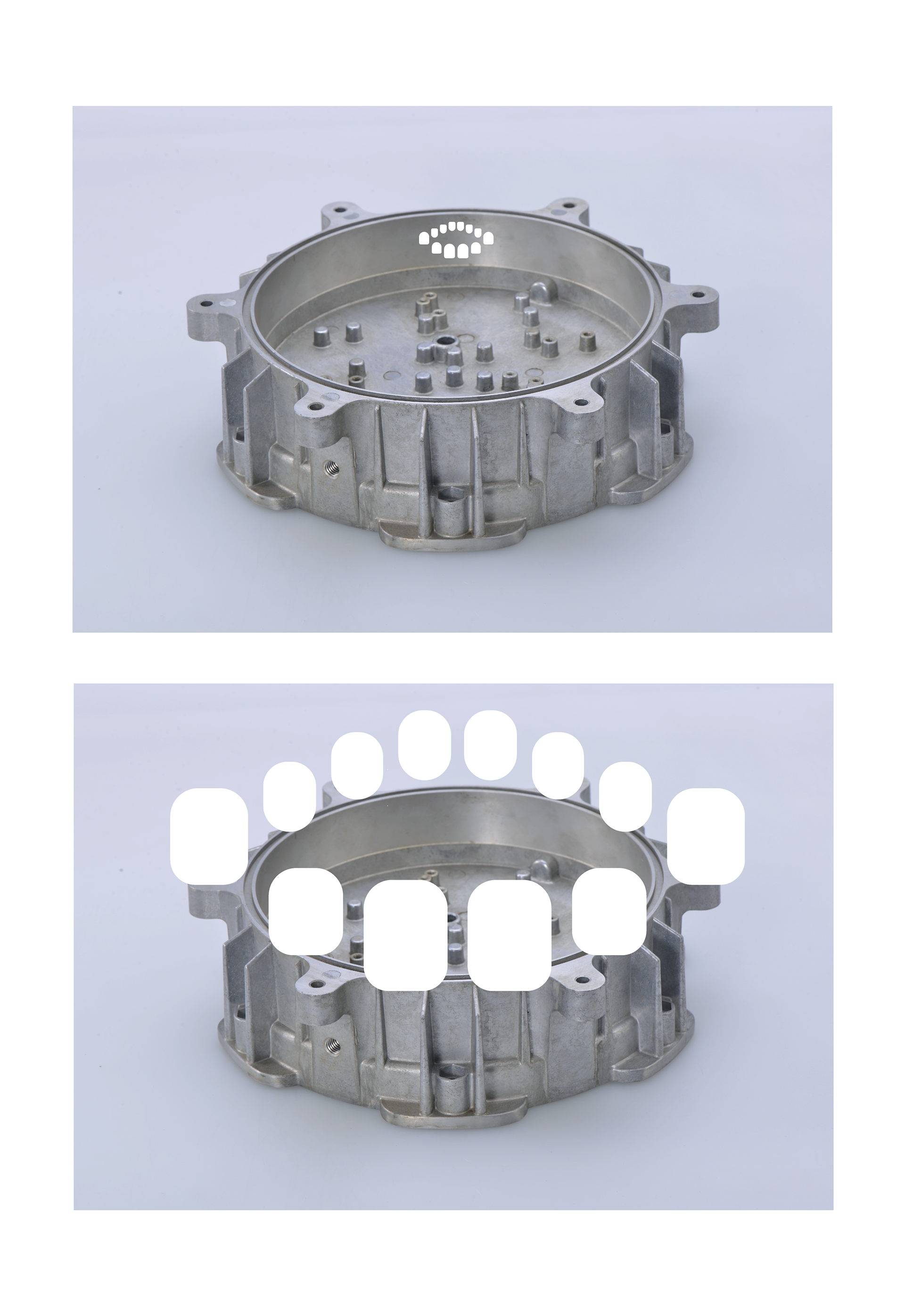
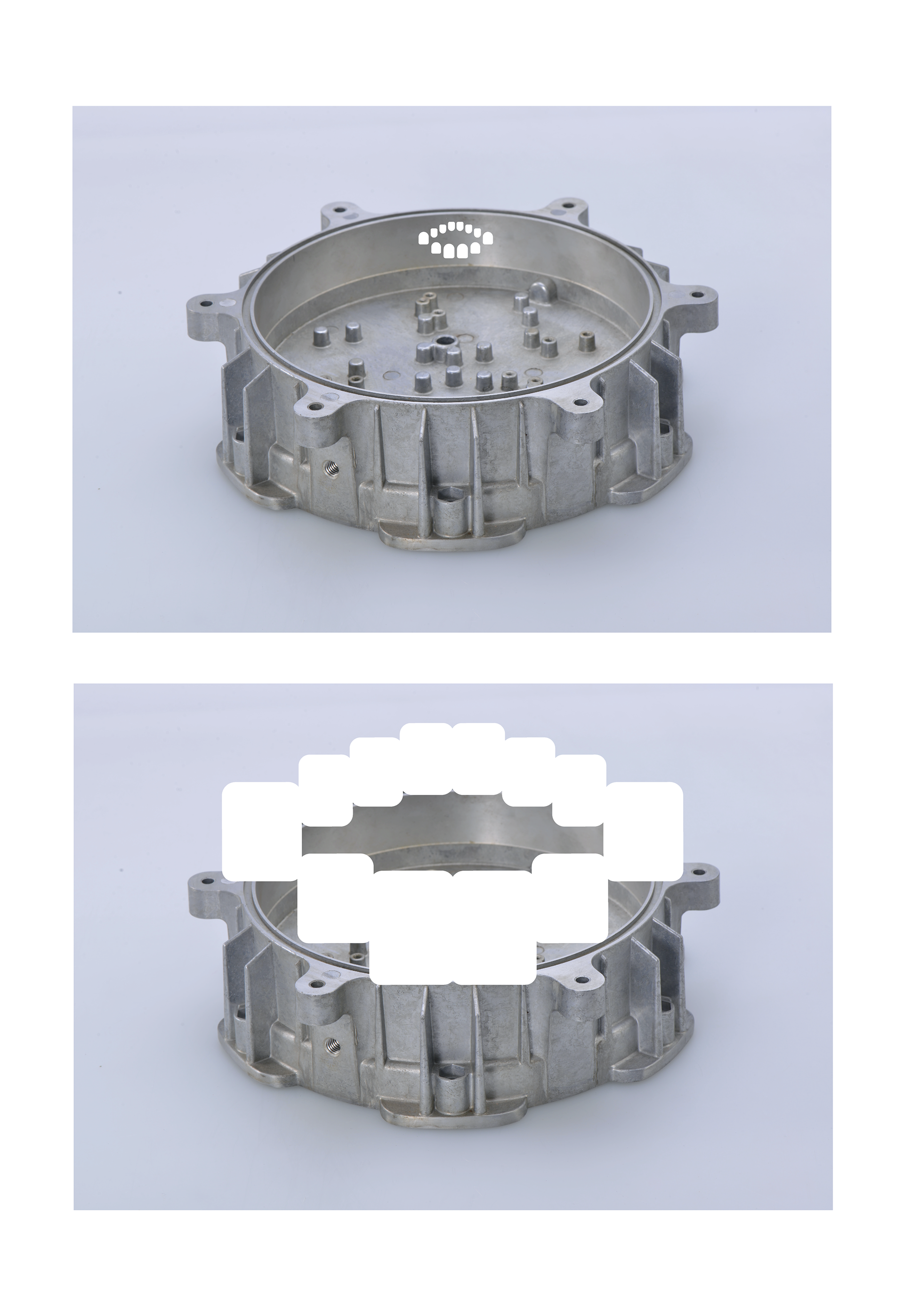
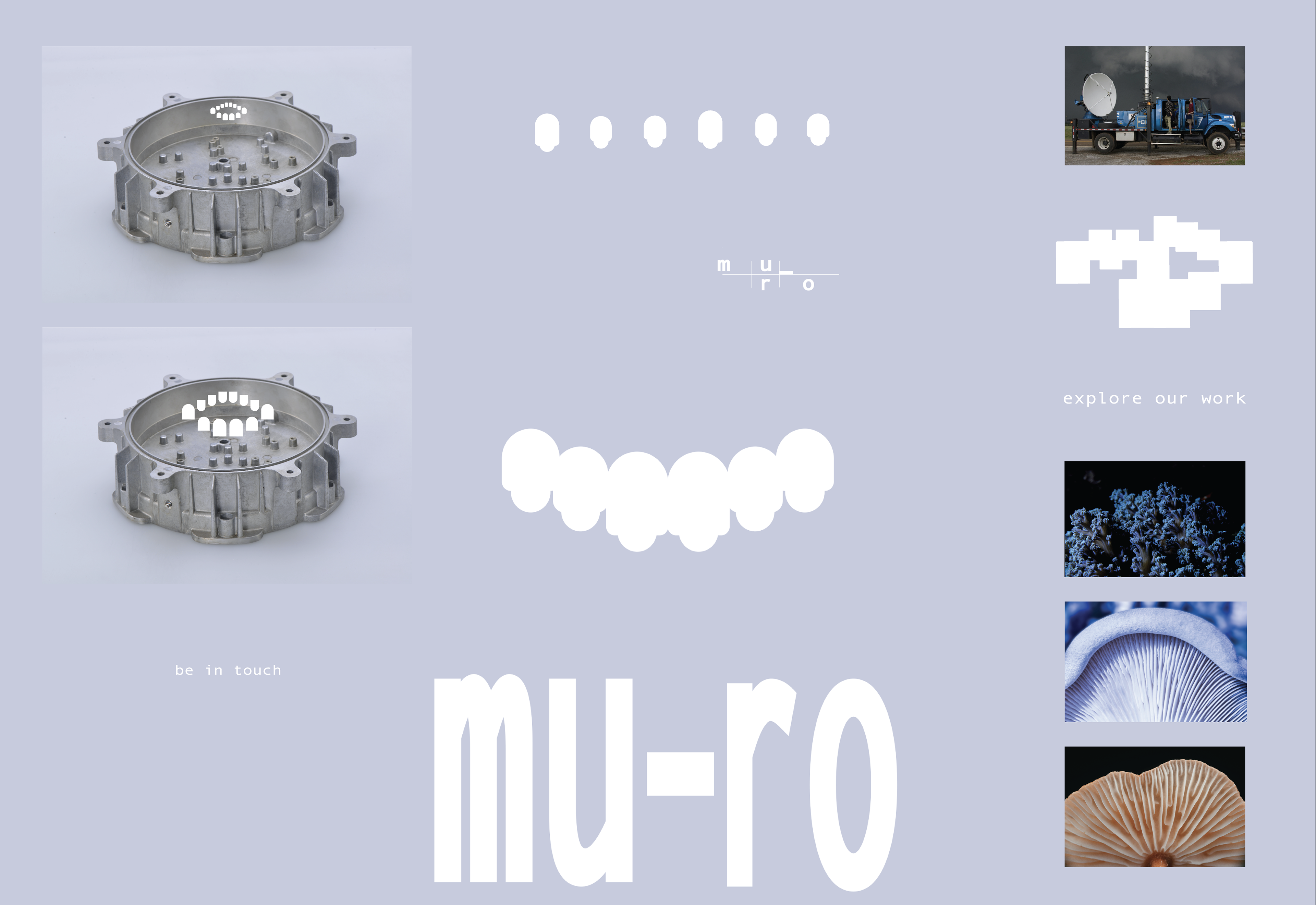
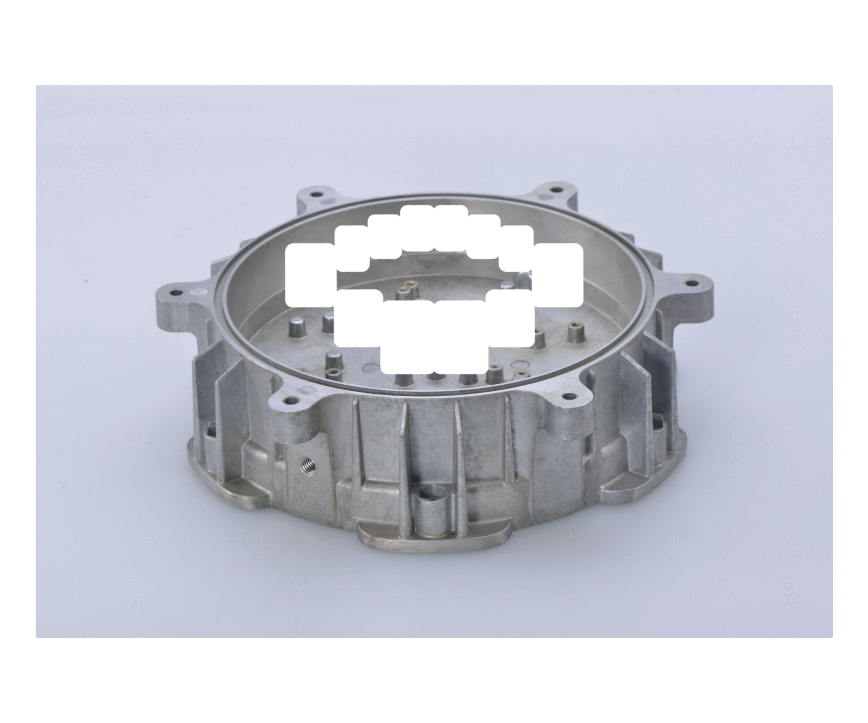
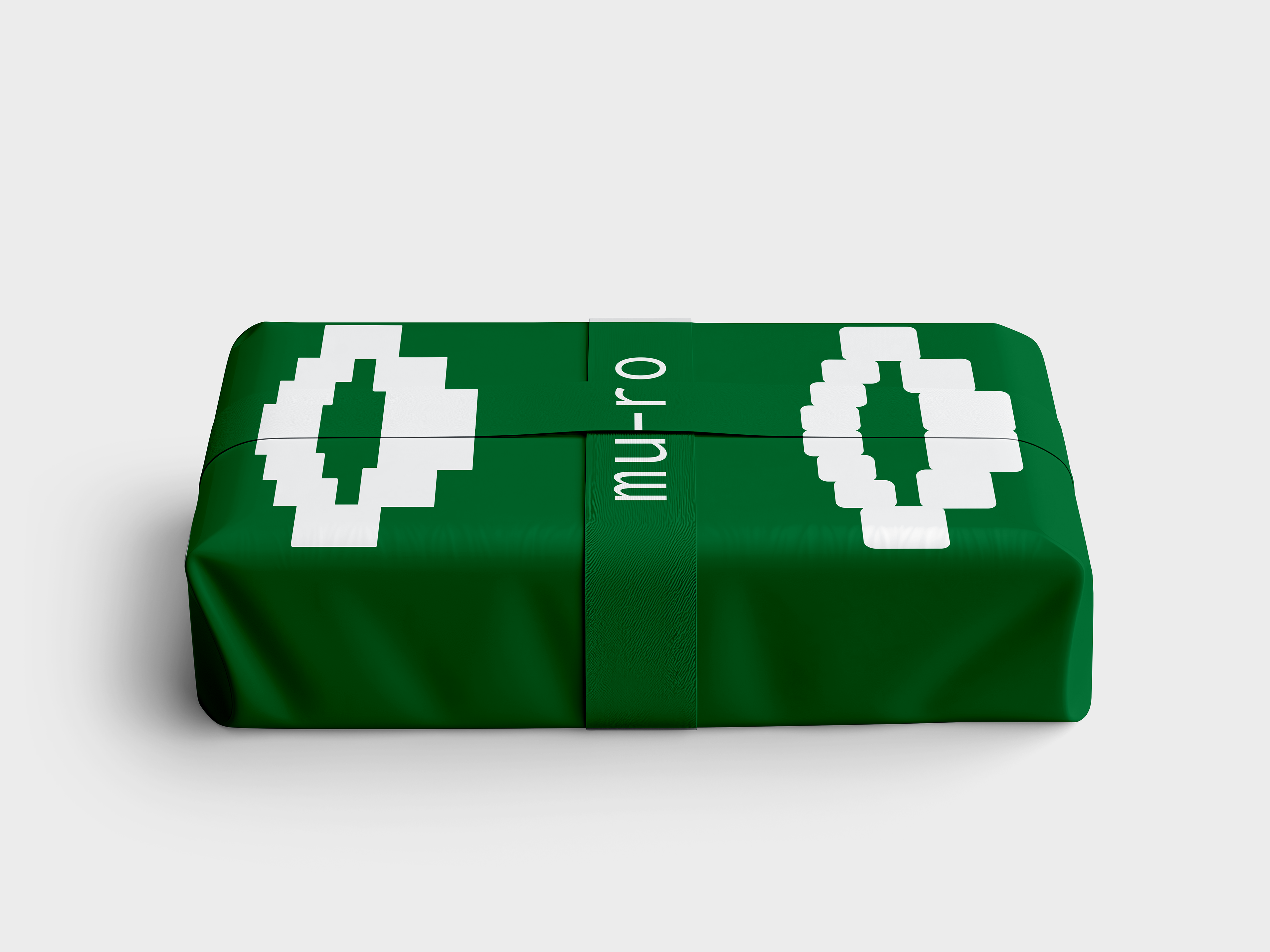
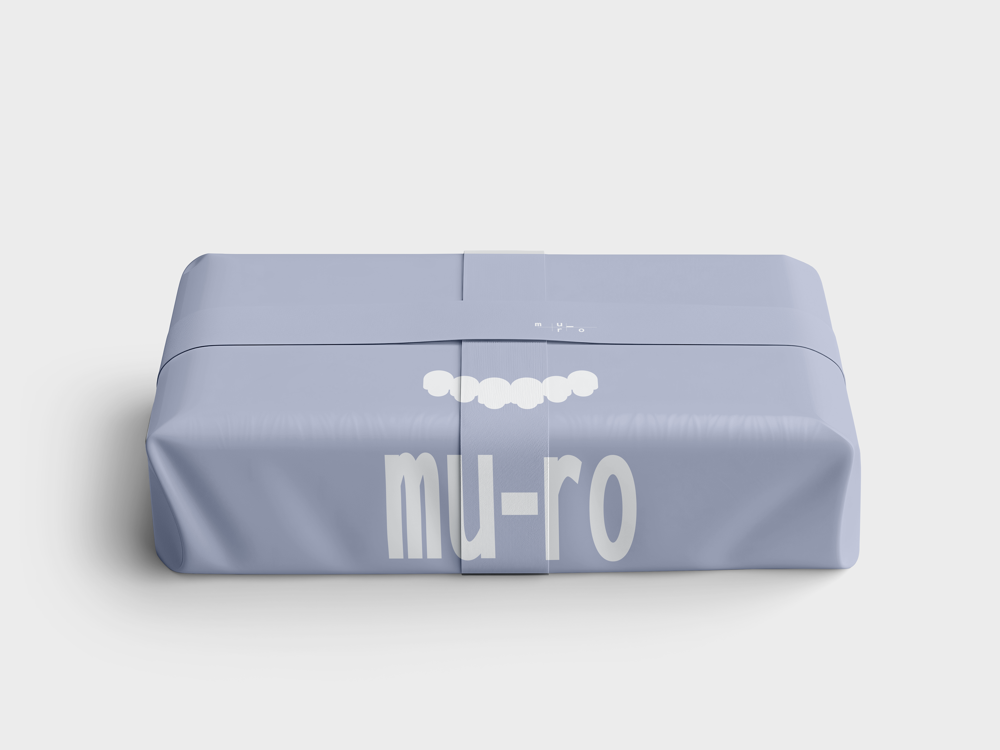
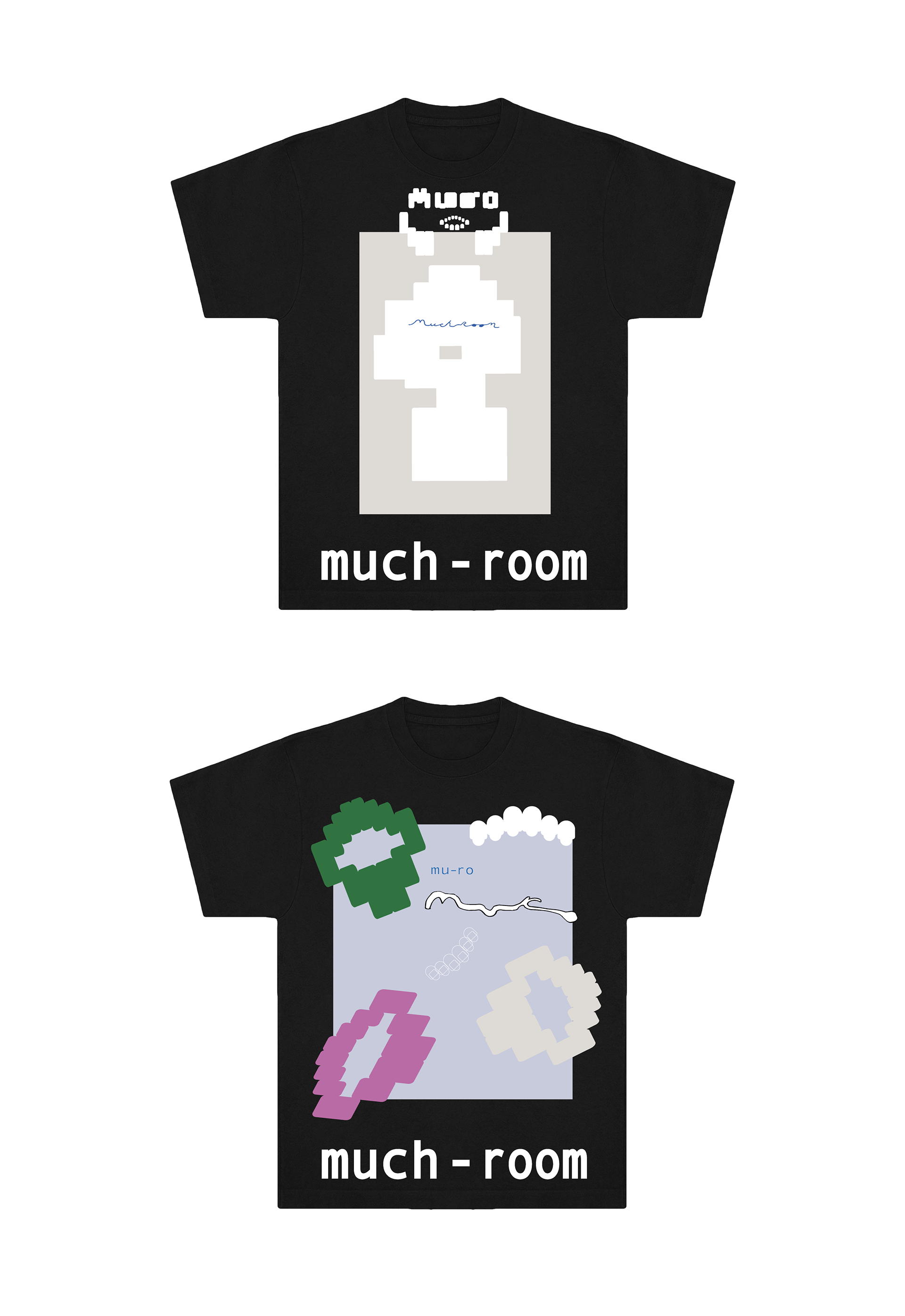
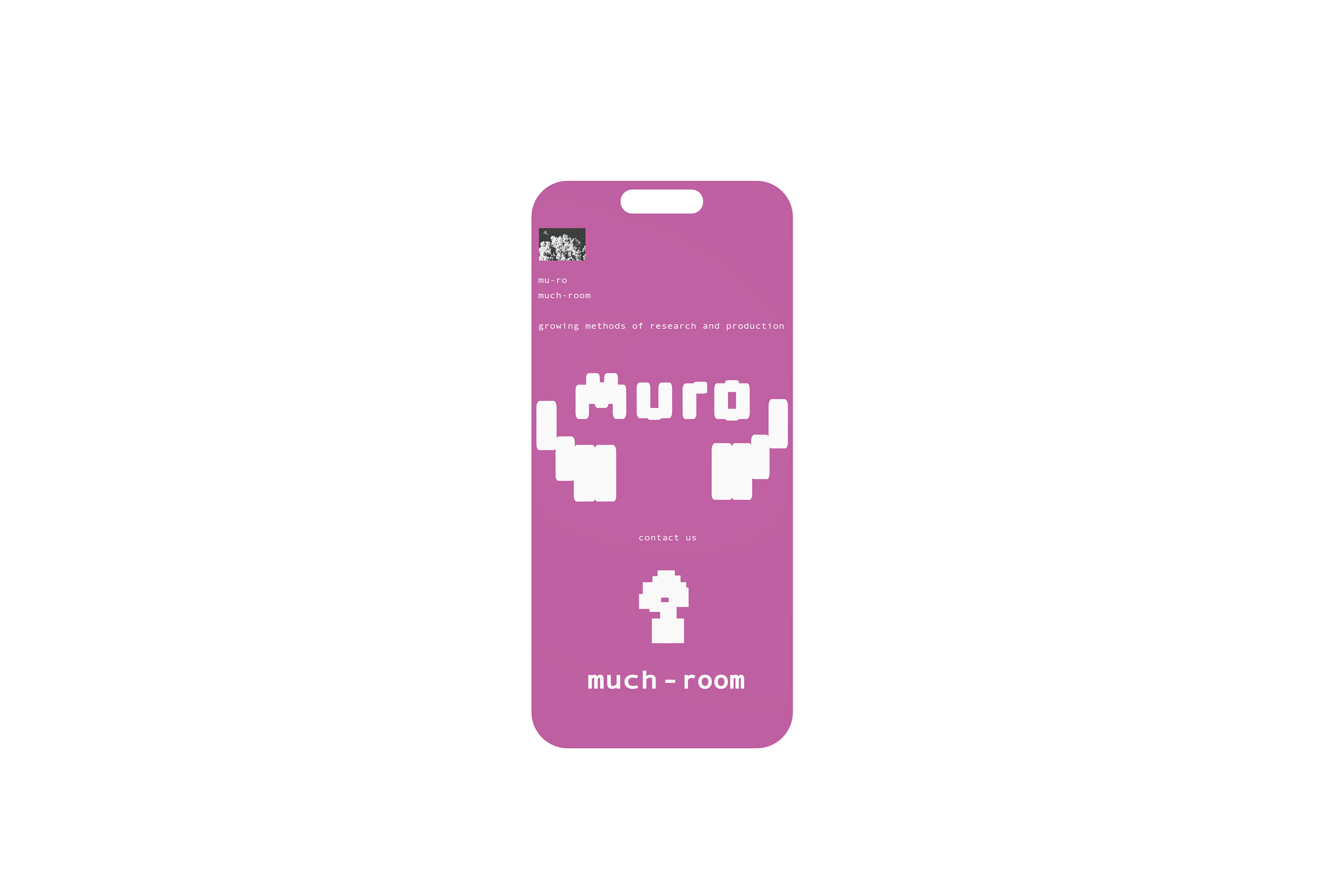
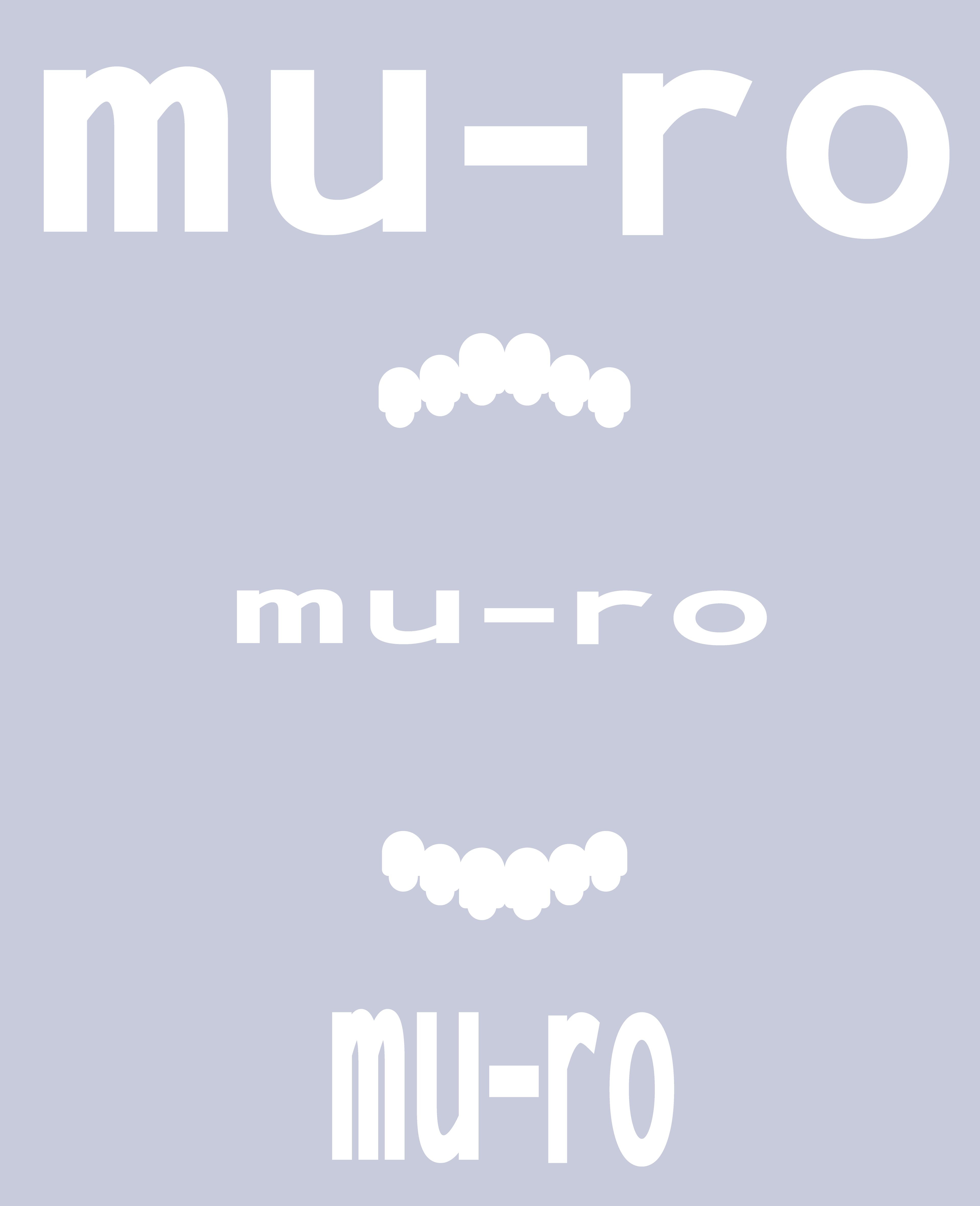
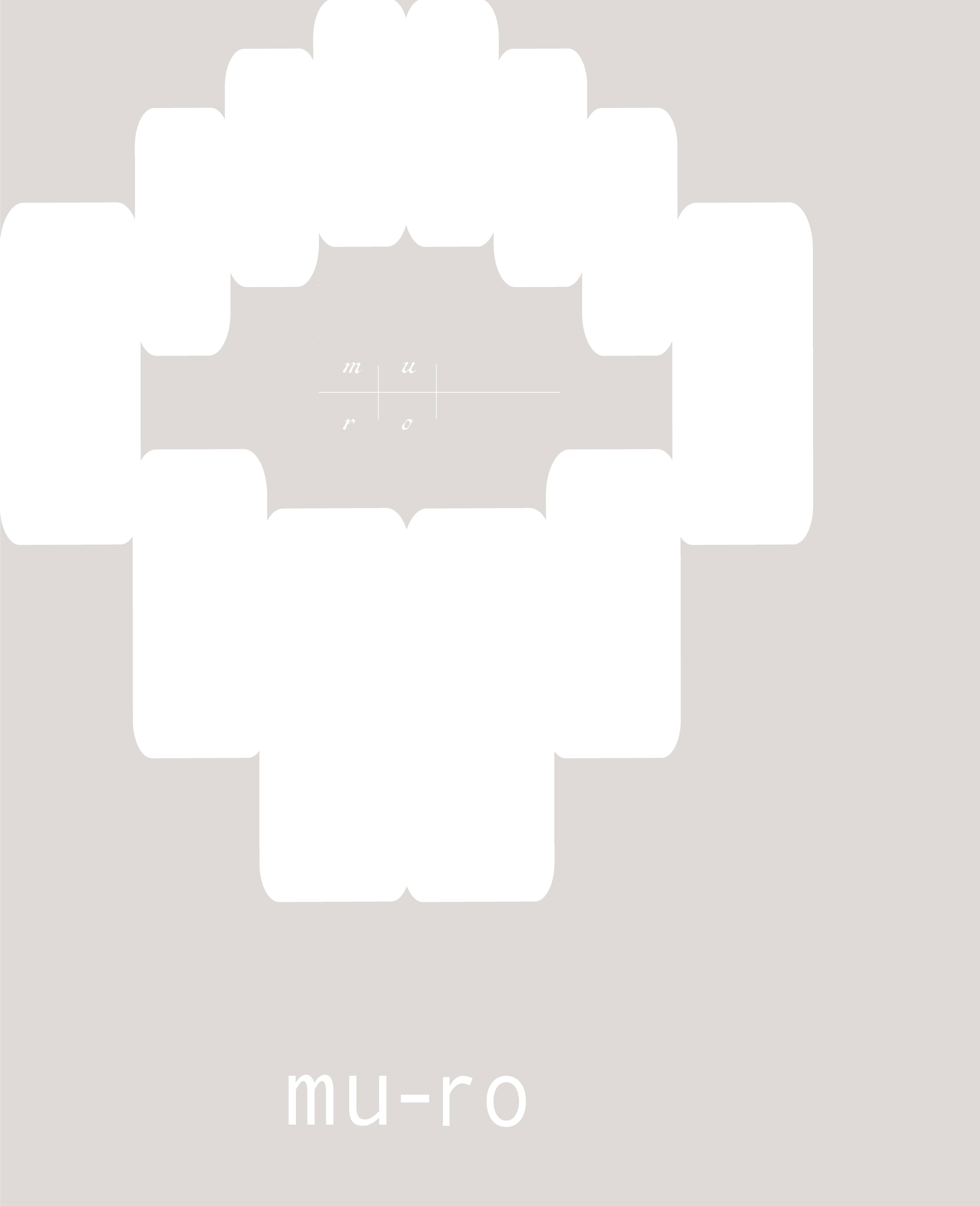
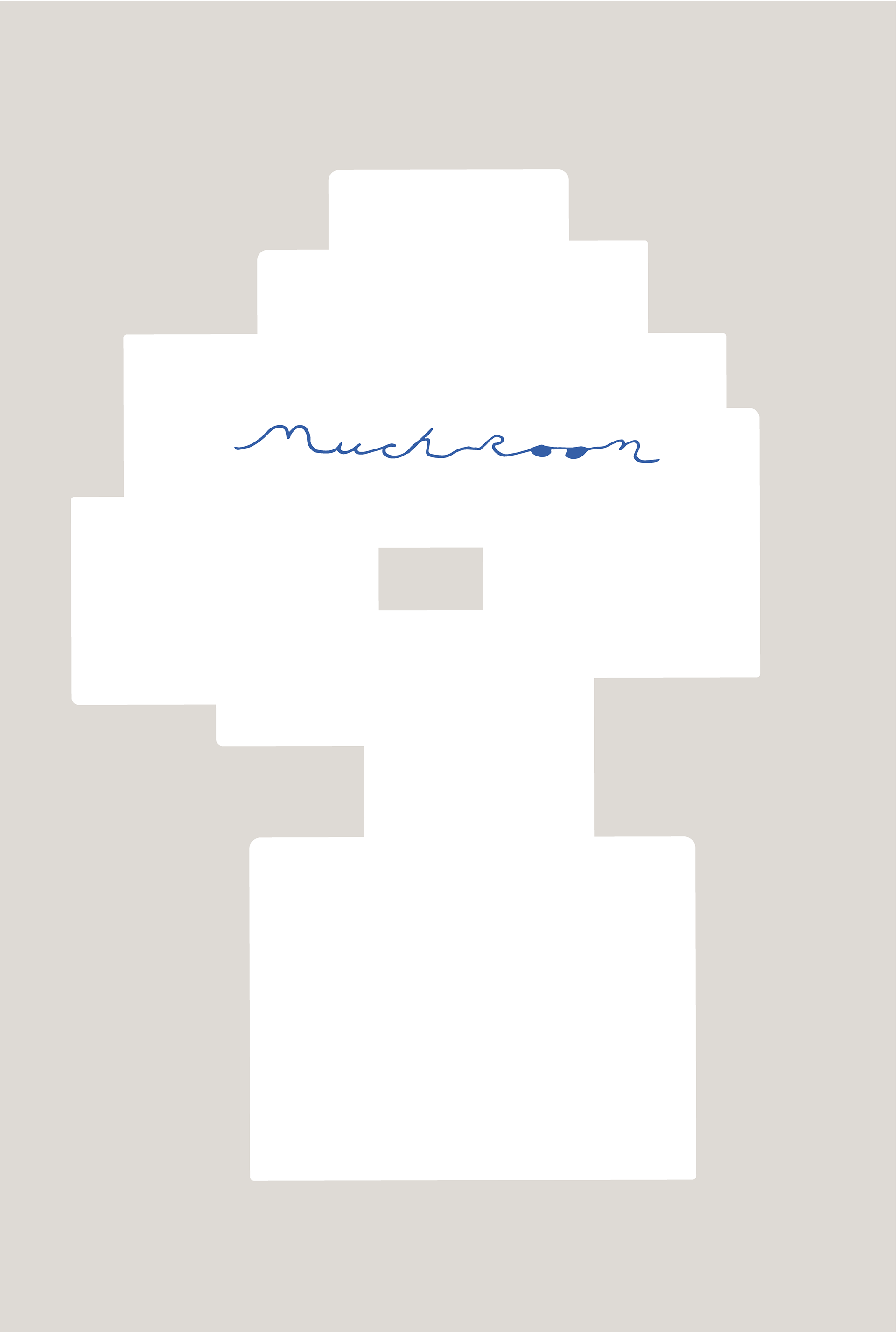
For the logos, I took the prototypes and adapted them, the rounded overlayed circles visually represent the shape of fungi/mushrooms, being an ode the brand name and also an origin play on the nature of teeth - an everlasting fingerprint and ode to human nature. The separated circle logos show process and time behind the company's work developments, and the space in between that alludes to there being "much" room for craft to take form. The formation of the rectangular and round edged square duo-logo extends the brand identity for playful expressions and formation of the pixel character, as seen in the collateral and digital expressions. When rotated, the duo-logo resembles two eyes, tying back to the means of observation denoted by the company name.
The brand colors were on the table at the early process stages, inspired by colorful dental molds, I also pulled in additional color and layout inspiration from Soviet-era designers, with graphics heavy in bold type, minimalism, and geometric styles.
Expression Items – packaging, collateral, merch, digital work, +
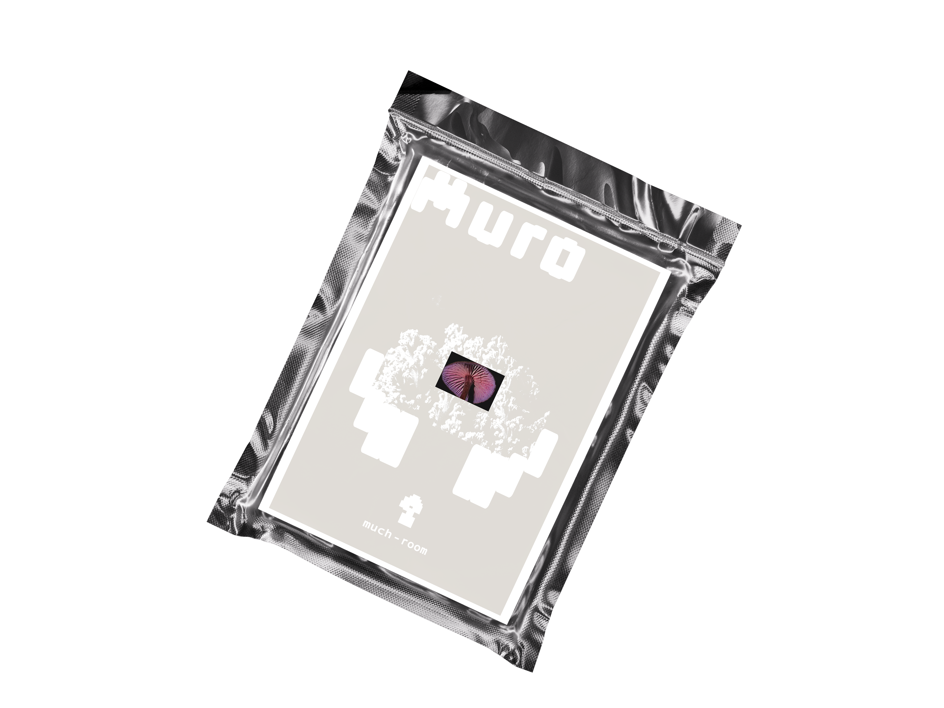
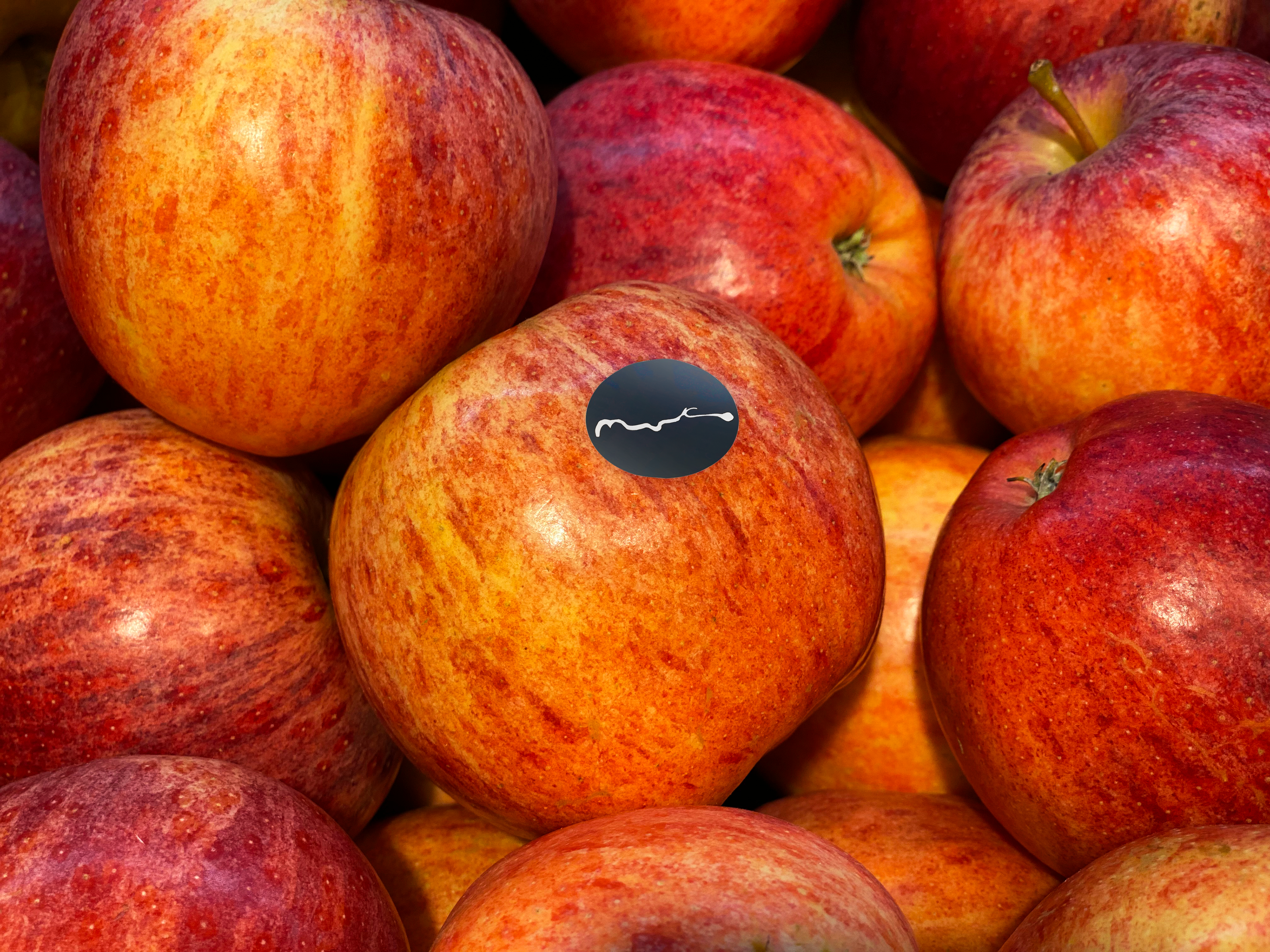
The mock ups include two concepts for packaging of employee assets, a flyer insert and packaged good featuring the stretched logo as a pixel character and accompanying graphics designed to represent elements of nature. Motion-design work can be seen as inspired by the Roundtable Productions animations, showing movement of the logo forming the pixel character while also reflecting movement of atoms and lab-work behind the scenes. A digital phone mock-up shows the website home page with an extended scroll image found lastly on this project page, and the t-shirts are merch pieces with a mix of brand graphics. The apple image features the handwritten type as a sticker and represents the pinnacle of creation. Additional expression items are business cards, office sheets, posters, website homepages, scratch paper, and the final image of the digital scroll experience.
Final Deliverables –
Graphics and everything in between – All work presented is my own. Enjoy!